Window Graphics Design: How to Attract Customers From the Street
Most businesses spend a lot of time thinking about what happens after someone walks in. The layout. The lighting. The product displays. The service experience.
But on a busy street, the real challenge is earlier than that: getting someone to stop.
That’s where window graphics design quietly becomes one of the highest-ROI marketing moves you can make. Your storefront window is a 24/7 billboard sitting right where your ideal customers already are. When it’s designed well, it does three jobs at once: it grabs attention, communicates what you sell, and gives people a reason to choose you over the place next door.
In this guide, we’ll break down how to use window graphics strategically, what design choices actually attract foot traffic, and how to avoid the common mistakes that make windows look cluttered or invisible.
Why window graphics work (and why most storefronts waste them)
When people are walking or driving, they’re scanning fast. They’re not reading paragraphs. They’re looking for signals: What is this place? Is it for me? Is it open? Is it worth stopping?
Window graphics are effective because they meet people in that exact moment of decision. A good window design creates instant clarity and emotional pull. A bad one creates confusion, visual noise, or nothing memorable at all.
Here’s the simple truth: window graphics don’t need to be “art.” They need to be understood in two seconds and felt in five. The goal is not to decorate your glass. The goal is to convert passersby into visitors.
This principle can also be applied when considering other aspects of your business such as the layout of your store which plays a crucial role in customer experience after they step inside.
Start with the street, not the screen
A common mistake is designing window graphics like a social media post or a website banner. But the street is a totally different environment. Social media content is designed for scrolling and clicking, while window graphics need to be impactful from a distance and in real-time.
People view your window from angles, at speed, in different lighting conditions, sometimes with glare, and often from across the road. That means your design has to be built for real-world conditions.
Before you design anything, answer these questions:
- How far away do people first see the window?
- Are they walking, driving, or both?
- Is the area bright, shaded, or heavily reflective?
- What competes with your window (signs, trees, parked cars, neighboring storefronts)?
Once you understand the viewing situation, your design decisions become much easier. You stop guessing and start designing with intent.
The 3-second rule: clarity beats cleverness
If someone can’t tell what you do quickly, they keep walking.
The most effective window graphics follow a simple hierarchy:
First, they show what you are (category). Then they show why you’re worth choosing (value). Then they show what to do next (action).
So instead of leading with a clever slogan that means nothing out of context, lead with clarity.
A few examples of “clear first, clever second”:
- A salon could lead with “Hair. Color. Extensions.” then follow with a more personality-driven line.
- A bakery could lead with “Fresh Pastries Daily” then add a small supporting message like “Baked at 6am.”
- A gym could lead with “Strength Training + Personal Coaching” then add “Free first session.”
Your window is not the place to hide the point.
Choose the right type of window graphics for your goal
Window graphics come in a few common formats, and each one is good for different situations. The right choice depends on privacy needs, sunlight exposure, how long the promo lasts, and how much of your interior you want visible.
Vinyl lettering and logos are perfect for clean branding, hours, and essential info. They’re simple, cost-effective, and look premium when spaced well.
Perforated window film (one-way vision) is great if you want bold visuals outside but still want visibility from the inside. It also reduces glare and adds privacy.
Frosted or etched vinyl works well for clinics, offices, and higher-end brands that want privacy and a polished look without blocking all light.
Full-coverage printed vinyl is best for high-impact campaigns or when you want the window to behave like a billboard.
Seasonal or promotional decals are ideal for sales, events, or limited-time offers, especially when you plan to swap them regularly.
A good design team will help you choose based on both aesthetics and practicality, not just what looks exciting on a mockup.
Design principles that actually attract customers
Great window graphics aren’t about cramming more in. They’re about making the right things impossible to miss. Incorporating effective design principles into your window graphics can significantly enhance their effectiveness in attracting customers.
1) Make it readable from a distance
If your main text can’t be read from at least 10 to 20 feet away (depending on your street), it’s too small, too thin, or too low-contrast.
Use bold fonts, strong weight, and clean letterforms. Avoid overly decorative type for core messaging. You can add personality in supporting elements, but your primary message should be instantly legible.
2) Use contrast like you mean it
Contrast is what makes a window “pop” in daylight. Light text on light interiors disappears. Mid-gray on glass disappears. Thin outlines disappear.
High-contrast combinations win: black and white, deep brand colors with white, dark navy with bright accents, or bold warm colors used sparingly.
If glare is a problem, you may need larger shapes, thicker fonts, and more solid coverage than you’d expect.
3) Create a focal point, not a collage
A window should have one obvious focal point. That might be a hero offer, a strong product visual, or a bold brand statement.
When everything is emphasized, nothing is emphasized. If your window looks like five posters fighting each other, people tune out.
4) Leave breathing room
Whitespace is not wasted space. On a window, whitespace is what makes your message feel premium and confident. It also improves readability dramatically.
A good rule: if your design feels “just a little too empty” on screen, it might be perfect on glass.
5) Design for the glass frame and obstacles
Window frames, mullions, door handles, stickers, security bars, and reflections all break up design. Your layout has to account for those interruptions so key elements don’t get sliced in half.
This is why measuring and templating the actual panes matters. A window graphic designed without accurate window dimensions almost always looks off in real life.
What to put on your window (the elements that convert)
A high-performing storefront window typically includes a few essentials. Not every business needs all of these, but most need a smart combination.
- Brand identification: logo or business name, plus a short descriptor if your name isn’t obvious.
- Core offer: what you sell or what service you provide.
- Reason to choose you: a differentiator, a benefit, or social proof.
- Next step: “Walk in,” “Book today,” “Order online,” QR code, phone number, or a short URL.
- Practical info: hours, entry direction, accessibility note, parking note, or “Open” cues if your street has lots of closed storefronts.
If you’re going to use a QR code, treat it like a real design element, not an afterthought. It needs contrast, a comfortable scan size, and a clear reason to scan, such as a menu, appointment link, or first-time offer.
The best window messaging by business type (quick inspiration)
You don’t need complicated copy. You need copy that answers what people care about in the moment.
For a restaurant or café, highlight your strongest hook: “Breakfast all day,” “Fresh pasta,” “Lunch in 10 minutes,” “Vegan options,” “Coffee roasted weekly.”
For a retail shop, lead with either category or taste: “Vintage streetwear,” “Minimal home goods,” “Outdoor gear,” “New arrivals,” “Try-on available.”
For a salon/spa, clarity plus one irresistible benefit works: “Hair + color,” “Walk-ins welcome,” “Book online Bars,” “First-time discount.”
For a clinic/office, trust is everything: “Same-day appointments,” “Insurance accepted,” “Private consultations Bars,” “5-star rated.”
For a gym/studio, reduce hesitation: “Beginner-friendly,” “Free first class,” “Strength + mobility,” “Small group training.”
Your window is a promise. Make it feel specific enough that the right customer thinks, “That’s exactly what I need.”
Promotions without looking cheap
Sales messaging can drive foot traffic fast, but only if it’s designed with restraint.
A window screaming “50% OFF” in five fonts might get attention, but it can also hurt brand perception, especially if you’re positioned as premium.
If you want promotional graphics that still feel on-brand, keep the structure clean. Use one strong offer, one supporting line, and one call-to-action. Let color and scale do the heavy lifting, not clutter. Incorporating graphic design principles can also enhance the effectiveness of your promotional messaging.
Also, avoid running constant “SALE” windows all year. If everything is a promotion, nothing feels special. Instead, rotate seasonal moments, limited-time bundles, new launches, or local-event tie-ins.
Common mistakes that quietly kill foot traffic
A lot of storefront windows fail for reasons that are easy to fix once you know what to look for.
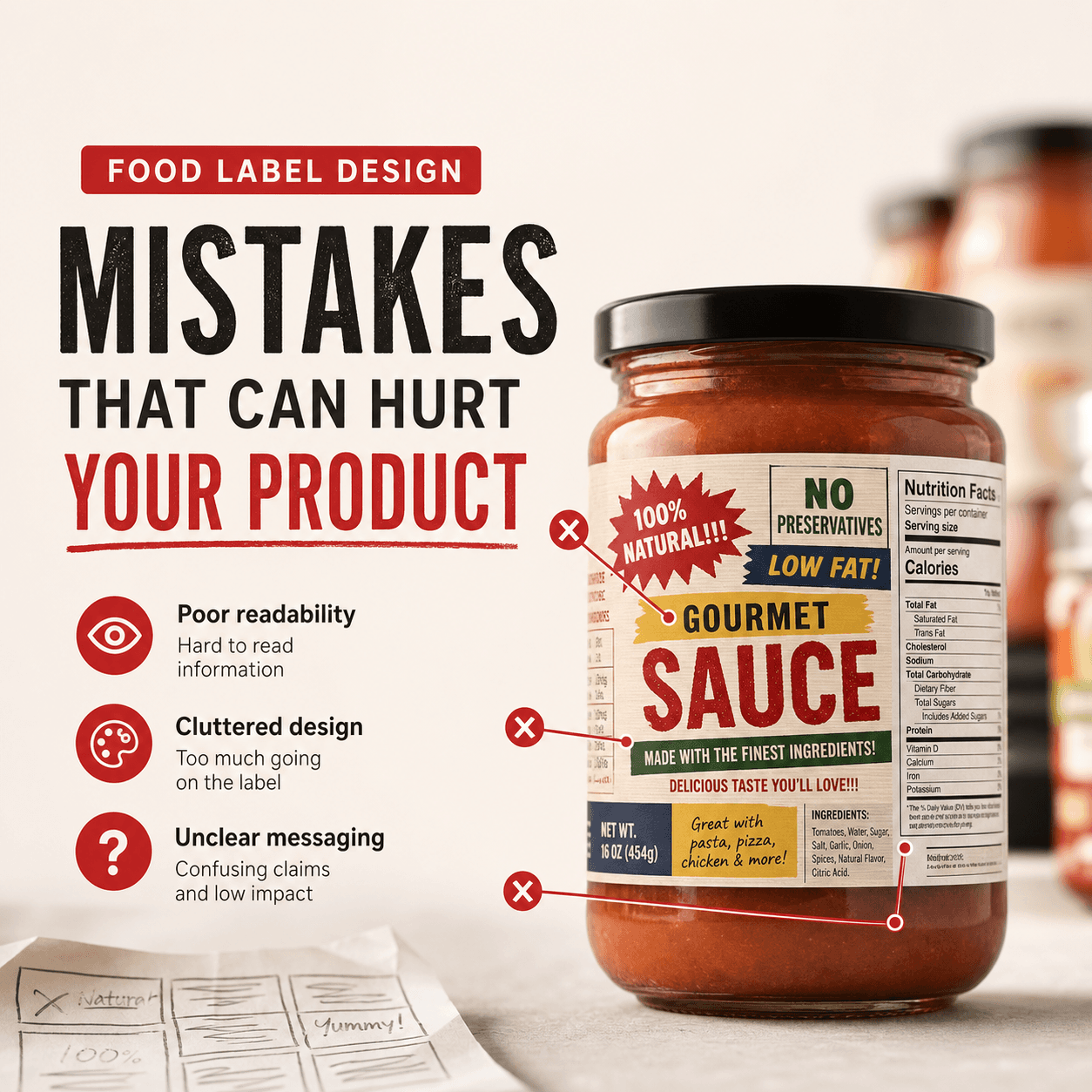
One big issue is too much text. Another is tiny design details that look great up close but disappear from the sidewalk. Poor contrast is also common, especially with light branding on reflective glass.
Another mistake is treating the window like a dumping ground for random stickers: payment logos, old promo decals, fading hours, social icons, and QR codes stacked in a corner. Each element may be “useful,” but together they dilute the main message.
And finally, many windows don’t match the interior experience. If your window feels premium but the inside feels messy, people feel misled. If the window feels chaotic but the inside is beautiful, you lose potential customers before they ever see it.
The process: how to plan window graphics that work
A strong window project usually starts with strategy, not software.
You measure the windows properly, take photos from different distances, and map where the most visibility is. Then you decide what the window needs to do: build awareness, drive walk-ins, increase bookings, promote a new product, or add privacy.
From there, you develop the design system: typography, color, messaging hierarchy, and layout that matches the brand. Next comes production planning, which includes choosing materials that fit sunlight exposure and how long the graphics need to last.
Finally, installation matters more than people think. A perfect design can look sloppy if it’s misaligned, bubbled, or cut poorly around edges. Clean edges and consistent spacing are what make a window look “expensive,” even with simple vinyl.
How often should you update your window graphics?
It depends on your business and location, but a good rhythm keeps your storefront feeling alive.
If you’re in a high-footfall area, even small seasonal updates can boost repeat attention. If you’re in a quieter street, you can lean into a strong evergreen design and refresh with promos when needed.
As a general approach, keep your core brand elements consistent, and rotate promotional layers on top. That way you’re not redesigning from scratch every time you run a new offer.
Window graphics and brand consistency (why it matters more than you think)
When someone sees your window, then your website, then your Instagram, they’re building a mental picture of your brand. If the styles don’t match, trust drops.
That’s why the best window graphics are not a one-off poster. They’re part of a complete identity. Same fonts, same tone, same visual rules. Even if your window message changes, the brand “feel” stays stable.
At Rs Graphic Design, this is the mindset we bring to every design job. Founded in 2017 with a mission to craft design solutions that deliver tangible results, we combine strategy and creativity across branding, print design, packaging, web design, vector illustration, custom graphic design, and more. Window graphics are simply one more place where smart design can do real work for your business.
FAQs
How much do window graphics cost for a storefront?
Pricing depends on window size, design complexity, material choice, and installation. Simple vinyl lettering costs less, while full-coverage prints cost more. A quick measurement and goal discussion usually clarifies budget fast.
What window graphics material is best for sunlight and heat?
For strong sun exposure, high-quality outdoor vinyl and UV-resistant inks matter most. Perforated film can reduce glare. The best option depends on lifespan, visibility, and whether you need privacy during daylight hours.
Will window graphics block light or make the store feel dark?
Not necessarily. Frosted vinyl and perforated film can maintain brightness while adding privacy. Even full prints can be designed with intentional negative space. Material choice and coverage percentage control how open the space feels.
How do I choose what message to put on my window?
Start with clarity: what you sell, who it’s for, and why it’s worth stopping. Add one action step like “Walk in” or “Book now.” Keep it readable from a distance and avoid overexplaining.
How long do window graphics typically last?
Quality window vinyl can last several years, especially on clean glass with proper installation. Promotional decals may be designed for shorter runs. Weather, sun exposure, cleaning habits, and material choice all affect longevity.
Ready to turn your windows into a customer magnet?
People are already walking past your storefront every day. The question is whether your windows are helping you win those moments, or quietly letting them slip away.
At RS Graphic Design, we don’t treat window graphics as decoration. We treat them as street-level strategy: clear messaging, bold design, and polished execution that makes your brand instantly recognizable and worth stepping into. If you want window graphics that actually pull customers in, we’d love to collaborate, measure your space, and design something that earns attention for the right reasons.
hello@rsgraphicdesign.com