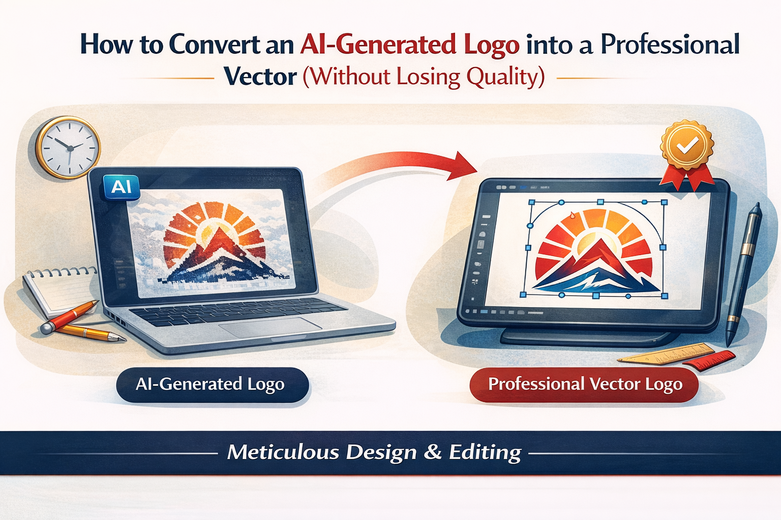
You can convert an AI-generated logo into a professional vector without losing quality, but you need to stop thinking like a “file converter” and start thinking like a “logo finisher.” The goal is not to trace the image and hope it works. Instead, you want clean geometry, correct spacing, crisp curves, and files that print perfectly at any size.
If you do it right, your logo becomes scalable, editable, and production-ready. If you rush it, you get wobbly edges, messy nodes, broken letterforms, and a mark that looks fine on-screen but falls apart in print. So in this guide, I’ll show you a practical workflow to turn an AI image into a real, professional vector logo.
At Rs Graphic Design, we see this exact problem a lot. Since 2017, Rs Graphic Design has helped brands turn rough ideas into sharp, consistent identities through branding, packaging, print design, web design, vector illustration, and custom graphic design. That same “precision first” approach is what makes vector conversion look expensive, even when it starts from an AI-generated logo.
AI-generated logos usually fail because they are images, not brand assets
AI-generated logos are often raster images, even when they look clean. Raster means they are made of pixels. Pixels blur when you scale up, and they print with soft edges. That is why a logo that looks okay on Instagram can look cheap on a business card or a product box.
A professional vector logo uses paths, not pixels. Paths scale infinitely. Paths also let you control every curve, corner, and spacing choice. That control is the whole point.
So before you convert anything, decide what “professional” means for your brand. In most cases, it means you can confidently use the vector logo on: A billboard, a favicon, an embroidered cap, a foil stamp, and a one-color invoice header. One asset should handle all of it.
Start by choosing the best possible AI-generated logo source file
You will get better vector results when your starting image is clean. That sounds obvious, yet it is the biggest lever you can pull.
If you can re-export or regenerate your AI-generated logo, prioritize these traits: strong contrast, minimal texture, no shadows, no gradients, and clear separation between shapes. Avoid tiny details that only work at one size.
Also, export as large as possible. A 2000 px or 4000 px wide image gives you more accurate edges to rebuild. A 512 px logo forces guesswork.
If your AI-generated logo includes text, try to get a version with the text separated. Better yet, ask the generator for “icon only” and “wordmark only.” You will rebuild type more cleanly by hand.
Decide whether you should redraw the logo instead of auto-tracing it
Here is the truth: auto-trace rarely produces a professional vector logo on its own. It creates too many nodes, and the curves look lumpy. It can be a starting point, but it is not the finish line.
You should redraw manually when the logo has clean geometry, simple curves, or type. You should consider auto-trace only when the logo is an organic illustration and you plan to simplify it anyway.
A good rule: if the logo needs to look “premium,” redraw it. If it needs to look “handmade,” you still redraw it, just with controlled imperfections.
Use the right tools for vector conversion, not just any converter website
You can convert an AI-generated logo into a professional vector using several tools. However, the best results come from tools that let you clean nodes, rebuild curves, and control alignment.
Adobe Illustrator is the standard. Affinity Designer is a strong alternative. Inkscape works too if you know it well. Online converters can export SVG files, but they usually create messy paths.
The key is not the button you click. It is what you do after the first vector appears.
Set up your file like a pro before you touch the Pen tool
Open a new vector document and place your AI-generated logo on its own locked layer. Lower the opacity to around 30–50%. Then create a new layer above it for your clean vector build.
Next, decide your artboard size. For most logos, a square artboard is fine. Keep it simple. You can export multiple sizes later.
Finally, turn on smart guides and snapping. Clean alignment saves time later.
Build the logo shape with fewer points and smoother curves
A professional vector logo looks clean because it is built clean. That means you use the fewest points needed to describe the shape.
When you convert an AI-generated logo into a professional vector, focus on curve quality first. Use smooth anchor points for curves and corner points only where you need true corners. Avoid the common trap of placing anchors everywhere.
As you draw, zoom in to check curve transitions, then zoom out to check overall balance. The zoom-out test is where most tracing mistakes become obvious.
If the AI-generated logo includes symmetrical elements, do not trace both sides. Draw one side, then reflect it. This ensures perfect symmetry and a more professional vector logo.
For creating complex designs like spirographs in Adobe Illustrator, consider following this guide on creating a line spirograph which provides useful insights into advanced techniques that can enhance your logo design process.
Simplify and normalize the design so it works at small sizes
AI-generated logos often include micro details. These details look impressive at 1000 px, but they vanish at 24 px. A professional vector logo must survive tiny sizes.
So test early. Shrink your vector build down to favicon scale. If it turns into noise, simplify it. Thicken thin strokes. Remove tiny gaps. Increase spacing. Make the icon read in one second.
This is also where you decide if you need two versions: a detailed primary logo and a simplified small-size mark. Brands do this all the time.
Rebuild text properly instead of tracing letters
If the logo has a wordmark, do not trace the text from the AI image unless you absolutely must. Traced letters tend to look uneven, and spacing becomes a nightmare.
Instead, identify the closest font and typeset the wordmark fresh. Then adjust kerning and optical spacing. If the AI-generated logo used a custom or weird style, you can still rebuild it, but do it as custom lettering with consistent stroke logic.
Once the typography looks right, convert it to outlines for final delivery. Keep a live-text version in your working file too, just in case the brand name changes later.
Fix spacing, alignment, and optical balance before you export anything
This part is why “vector conversion” is really “logo finishing.”
Align shapes with intention, but trust your eyes too. Optical centering often beats mathematical centering, especially when considering pixel perfection. Check consistent corner radii. Match stroke weights. Ensure negative space feels even.
If your logo has an icon plus wordmark, test multiple lockups: horizontal, stacked, and icon-only. Even if the client only asked for one, providing variants makes the logo easier to use.
At Rs Graphic Design, this is where our team’s multidisciplinary experience matters. Branding, print design, packaging, and web design all punish sloppy spacing in different ways. So we finish logos with real-world use in mind, not just screen previews.
Create clean color versions and one-color versions that print well
A professional vector logo is never just the “full color” version.
You need a primary color version, a black version, a white version, and often a single-color version that works on light and dark backgrounds. If your AI-generated logo relies on gradients, you should also create a flat version. Many production methods cannot use gradients.
Also, define your colors properly. Set up global swatches. Use CMYK values for print and RGB for digital. If you have brand guidelines, match them.
When you convert an AI-generated logo into a professional vector, this color work is where quality becomes obvious.
Export the vector logo in the formats businesses actually need
Once the file is clean, export deliverables. Most brands need at least these:
- AI or EPS for print shops and long-term editing
- SVG for websites and UI
- PDF for easy sharing and proofing
- PNG (transparent) for quick use in documents and social
Name files clearly. Organize by color and background. Make it impossible for someone to use the wrong version.
If you are building a full identity, consider a simple logo kit folder structure. It saves hours of back-and-forth later.
Quality checklist: how to tell if your vector logo is truly professional
Before you call it done, run a quick audit. A professional vector logo should pass these checks.
Zoom in and confirm edges are smooth. Then zoom out and confirm the icon reads instantly. Print a test on paper. Also, place it on a dark background and a busy photo.
If any part looks shaky, it will look worse in real use. Fix it now.
A strong vector conversion feels boring up close because it is so clean. That is a good sign.
Common mistakes that ruin AI-to-vector conversions
Most bad results come from predictable habits. If you avoid these, you will instantly improve the final vector logo.
People rely on auto-trace as a final step. Others keep hundreds of nodes per shape. Some trace text and never fix kerning. Many forget one-color versions. A lot of files export with random clipping masks and stray points.
If you want a professional vector logo, treat the file like a product. Clean it, test it, and package it.
When it makes sense to hire a professional vector illustrator
Sometimes the fastest option is not doing it yourself. If the AI-generated logo is complex, or if the brand is going to print packaging, signage, or merchandise, the vector work needs to be perfect.
That is where a professional team helps. Since 2017, Rs Graphic Design has taken early-stage visuals and turned them into high-impact brand assets with meticulous attention to detail. We collaborate, refine, and polish until the logo works everywhere your brand shows up.
If you want the logo to look premium, consistent, and production-ready, professional vector illustration pays for itself quickly.
FAQs
Can I convert an AI-generated logo into a professional vector for free?
Yes, but free tools often create messy paths. You can still convert an AI-generated logo into a professional vector if you redraw and clean nodes manually afterward.
What is the best format for a professional vector logo?
AI, EPS, PDF, and SVG are the most useful. A professional vector logo usually ships as a logo kit, including print-ready and web-ready files with clear naming.
Why does auto-tracing make my logo look rough?
Auto-trace adds too many anchor points and uneven curves. That creates bumpy edges. A professional vector needs fewer nodes, smoother handles, and consistent geometry.
How do I keep sharp edges when converting to vector?
Use high-resolution source art, rebuild with the Pen tool, and avoid excess points. Then test at small sizes. Clean corners and consistent stroke logic preserve sharpness.
Do I need to recreate the text instead of tracing it?
Most of the time, yes. Rebuilding type with a proper font or custom lettering looks cleaner. Traced letters usually show uneven curves and poor spacing in print.