Why Cheap Logo Design Costs More in the Long Run
If you’re starting a business (or rebranding an existing one), it might be tempting to grab a “$20 logo” from a marketplace and call it a day. On the surface, it feels efficient. You get a file, a symbol, a name in a nice font, and you can move on to the real work.
However, in practice, cheap logo design usually isn’t cheap. It’s just underpriced upfront and overpriced later, because you end up paying in rework, lost trust, inconsistent branding, printing issues, and missed opportunities you can’t easily measure.
Below is an honest, practical breakdown of why “budget logos” so often become expensive logos.
The real job of a logo (it’s not just looking good)
A logo is more than just a pretty design; it's a shortcut to recognition. It’s the symbol people associate with your reputation, service quality, and style. A logo needs to work in various real-world scenarios, not just inside a perfectly framed mockup.
A strong logo is usually:
- Distinct enough to be remembered
- Simple enough to scale down and still hold up
- Flexible enough to work in one color, full color, print, web, packaging, and signage
- Designed to match the brand personality you want people to feel
Cheap logos tend to aim for “looks cool” before “works everywhere.” That’s where the long-run cost begins. To avoid this pitfall and ensure your logo serves its purpose effectively, consider investing in professional services like those offered by RS Graphic Design.
The hidden cost of looking like everyone else
Many low-cost logo offers rely heavily on templates, overused icon packs, and trendy layouts that get repeated across industries. Even when a designer “customizes” it, the underlying structure often remains familiar.
The problem is not just originality. It’s positioning.
If your logo looks similar to five competitors, customers don’t get a clear mental hook. They may not consciously notice why they’re confused, but the result is the same: weaker recall, weaker trust, and slower brand growth.
In crowded markets, differentiation is not a luxury. It’s how you survive.
You’ll pay twice when the files aren’t professional
This one is painfully common. You pay for a cheap logo, then later you learn you didn’t actually receive what you needed.
Here’s what tends to happen: you get a low-resolution PNG or JPEG that looks fine on social media. Then you try to print it on a banner, embroidery, packaging, or a vehicle wrap, and suddenly the edges look rough, the colors shift, and the logo falls apart.
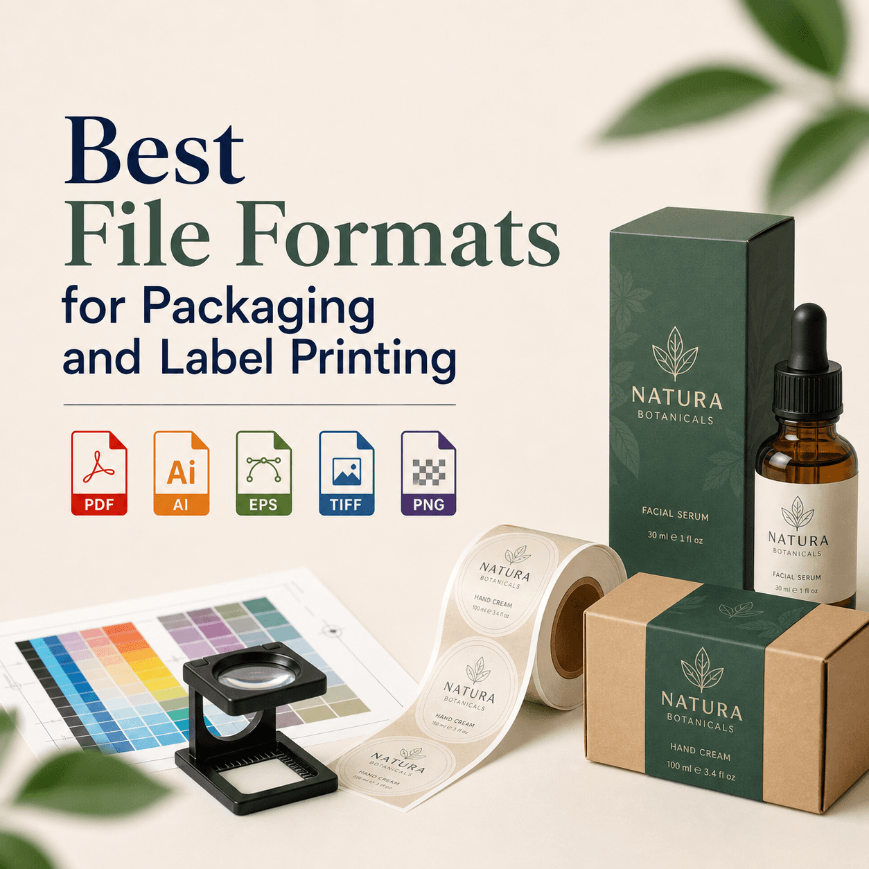
Professional logos typically require properly prepared deliverables, like vector files (AI/EPS/SVG), print-ready PDFs, correct color profiles, and clean variations. When those files are missing, you end up hiring someone else to rebuild it, which often costs more than getting it done right from the start.
Cheap logos break the moment your business grows
In the early days, you might only need a website header and an Instagram profile image. But growth adds real-world branding needs fast:
You need a favicon, social banners, email signatures, invoices, proposal templates, packaging labels, product inserts, uniforms, stickers, signage, and sometimes app icons or UI elements.
A logo that was never designed as a system becomes a bottleneck. You start improvising. Someone stretches the logo. Someone changes colors “just this once.” A vendor redraws it by hand. Your brand becomes inconsistent, and inconsistency always looks unprofessional, even when your service is excellent.
That inconsistency is a cost. It shows up as lower conversion rates, more customer hesitation, and more effort needed to “prove” you’re legitimate.
“Fast” usually means no strategy (and strategy is what makes it sell)
Most cheap logo processes skip the part that actually makes design valuable: discovery and strategy.
A real logo design process should ask questions like:
Who are you targeting? What do they value? Are you premium, friendly, bold, minimal, traditional, innovative? What do you want to be known for? What should the logo signal in two seconds?
When you skip that, you don’t get a brand mark. You get decoration.
And decoration doesn’t guide your marketing, doesn’t sharpen your message, and doesn’t create trust faster. That’s why two businesses with similar offerings can perform very differently, because one looks like a brand and the other looks like a side project.
Rebranding later is more expensive than branding properly now
When a cheap logo starts creating problems, most businesses eventually rebrand. The “new logo” is rarely the only expense.
Rebranding often triggers a domino effect: redesigning your website visuals, updating social media graphics, reprinting materials, revising packaging, changing signage, recreating ad creatives, and fixing old assets floating around online.
Even if you do the redesign cheaply again, the operational cost of switching is real. And the longer you wait, the more places your old logo exists.
A strong first brand identity reduces this risk and keeps you from rebuilding the plane mid-flight.
Customers judge the cover (even if they shouldn’t)
People are visual. Before they understand your offer, they react to your presentation.
If your logo looks generic, inconsistent, or poorly crafted, it creates doubt. Doubt leads to hesitation. Hesitation leads to lower inquiries, shorter calls, more price objections, and more “let me think about it.”
This matters most for service businesses, startups, and small brands competing with established players. Your logo won’t “close” a customer on its own, but it absolutely affects how quickly people trust you enough to take the next step.
In other words, cheap logos can quietly reduce your revenue without leaving a clear paper trail.
The opportunity cost: weak branding makes marketing harder
Marketing gets easier when your brand is clear.
When your logo, typography, colors, and overall visual identity are consistent, your content looks cohesive. Your ads look more credible. Your social posts look like they belong to a real business. People start recognizing you without reading your name every time.
With a cheap logo, businesses often compensate by doing more: more discounts, more ad spend, more explaining, more “trust-building” content. Some of that is normal, but if your visuals are fighting you, every marketing effort costs more.
Strong branding is a multiplier. Weak branding is friction.
What “good” logo design actually buys you
When you invest in a properly built logo, you’re not just paying for a symbol. You’re paying for reduced risk and smoother execution across everything you do next.
A professional approach usually gives you:
- A logo that scales cleanly from tiny icons to large signage
- Primary and secondary variations (horizontal, stacked, icon-only)
- Clear spacing and usage rules so vendors don’t guess
- A color system that works in print and digital
- Typography guidance that keeps your materials cohesive
- File formats that printers, developers, and marketers can use immediately
Most importantly, you get a logo that fits your brand’s direction, not the designer’s favorite trend that month.
A quick reality check: “cheap” isn’t the problem, “wrong” is
Not every affordable logo is bad. And not every expensive logo is good.
The real issue is when the price reflects a process with missing fundamentals: no research, no originality, no scalability, no proper files, no revisions, and no accountability.
If you’re evaluating a designer or agency, focus less on the number and more on the process and deliverables. Ask what you receive, how decisions are made, and how the logo will work across your real use cases.
Where RS Graphic Design fits into this (and why it matters)
Founded in 2017, RS Graphic Design has a clear mission: to craft exceptional design solutions that deliver tangible results and elevate your brand. We combine strategic insight with creative expertise across various domains including branding, print design, packaging, web design, vector illustration, and custom graphic design.
In practical terms, our approach is straightforward: we don’t design logos as isolated art pieces. Instead, we create them as working brand assets that need to perform in the real world. This involves navigating through various touchpoints, adhering to deadlines, collaborating with vendors, all while keeping future growth in mind.
Collaboration is key to achieving quality. When we understand your business goals and audience, the final mark transcends being just “nice.” It becomes a useful asset.
Final thoughts (the simplest way to think about it)
Cheap logo design may seem appealing at first but often costs more in the long run. The savings are only visible at checkout; the real costs surface later when you attempt to print, scale, differentiate, market, and grow.
If you're serious about building a brand that people recognize and trust, your logo should be designed like an asset, not an afterthought.
FAQs
Is a cheap logo ever “good enough” for a new business?
Sometimes it can be if you only need a temporary mark and are aware that you'll replace it soon. However, the risk lies in building marketing assets around it and later paying more to rework everything.
What files should I receive with a professionally designed logo?
At minimum, you should receive vector files (AI/EPS/SVG), print-ready PDF, and web formats (PNG/JPG). Ideally you also get color variations, spacing guidance, and a simple usage sheet. It's crucial to understand the difference between vector digitizing and raster graphics as quality matters significantly in areas like embroidery.
Why do cheap logos look fine online but fail in print?
Because many are made as low-resolution raster images, not vectors. Print requires high-quality scalable artwork, correct color settings, and clean edges that don’t pixelate or blur.
How do I know if a logo is original and not a template?
Ask about the design process, sketches, and rationale. Reverse image search can help, but the best indicator is whether the designer can explain decisions tied to your brand and competitors.
What’s the difference between a logo and a full brand identity?
A logo is one element. A brand identity includes colors, typography, layout rules, supporting graphics, and guidance that keeps everything consistent across web, print, packaging, and marketing materials.
How often should a business redesign its logo?
Only when the current logo limits growth, no longer matches your positioning, or looks outdated compared to your market. Frequent redesigns can confuse customers, so it’s better to build strong foundations early.
Ready to do it right (without wasting money later)?
If you’re feeling that quiet worry of “we need a logo, but we also need to look legit,” we get it. At RS Graphic Design, we don’t just deliver a logo file. We build a brand-ready asset that holds up in print, on screens, and as your business grows.
If you want a logo that actually works (and saves you from expensive fixes later), let’s collaborate and create something extraordinary together. Reach out to RS Graphic Design, and we’ll take it from there.
hello@rsgraphicdesign.com