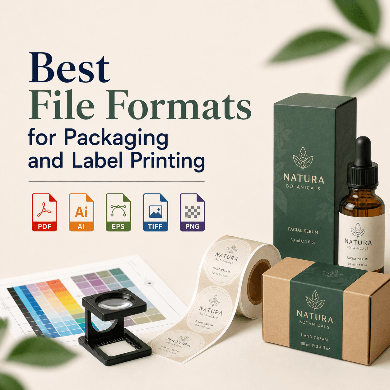
CMYK vs RGB: Why Your Print Colors Look Different
If you’ve ever designed something that looked perfect on your screen, only to see it come back from the printer looking darker, duller, or just “off,” you’re not imagining it. This is one of the most common (and frustrating) moments in design, especially when you’re dealing with brand colors, product packaging, or anything where color accuracy matters.
The main reason is simple: screens and printers don’t speak the same color language. Screens use RGB (an additive color model), while most printers use CMYK (a subtractive color model). And when your design moves from one world to the other, colors can shift in ways that feel unpredictable unless you know what’s happening behind the scenes.
In this guide, we’ll break it down in plain English, show you what causes the differences, and share practical steps to make your print colors match your expectations much more closely.
RGB and CMYK explained (without the jargon)
Let’s start with what these two actually are.
RGB stands for Red, Green, Blue. It’s an additive color model, which means colors are created by adding light together. When you mix red, green, and blue light at full intensity, you get white. This is how phones, monitors, TVs, and tablets display color. Since it’s light-based, RGB can produce very bright, saturated colors that almost glow.
On the other hand, if you're seeking professional help with graphic design to ensure accurate color representation across different mediums, consider reaching out to experts like those at RS Graphic Design.
CMYK stands for Cyan, Magenta, Yellow, Key (Black). It’s a subtractive color model, which means colors are created by subtracting light using ink. The paper reflects light, and inks absorb parts of that light, leaving the color you see. In theory, cyan + magenta + yellow should make black, but in real printing it tends to make a muddy dark brown, so black ink (K) is added for depth and detail.
Here’s the quick mental model: RGB is light, while CMYK is ink. When you shift from light to ink, you almost always lose some brightness.
Why colors look better on screen than on paper
If you want the one-sentence answer: screens are backlit; paper isn’t.
Your monitor literally shines light through pixels. Printed paper relies on whatever lighting is in the room. That alone explains why your neon greens, vibrant blues, and bright oranges often look less intense after printing.
But there’s more going on than brightness. A few hidden factors stack up:
- A screen can display a wider range of very vivid colors than standard printing can reproduce, especially in greens, blues, and bright pinks. That’s why some colors that look totally normal in RGB simply don’t exist in CMYK, at least not in the same intensity.
- Also, your eyes respond differently to emitted light versus reflected light. The same “numeric color” can feel different when it’s glowing from a screen compared to when it’s sitting on paper under overhead lighting.
The real culprit: gamut (and why it matters)
“Gamut” is just a fancy word for the range of colors a system can reproduce.
Most screens can show a larger, brighter gamut than CMYK printing. So when you design in RGB, you might unintentionally use colors that are outside the CMYK gamut. When you convert to CMYK, the software has to make a compromise, and that’s where shifts happen.
A classic example is a bright, electric blue. On screen it looks punchy and modern. In CMYK, it often turns into a flatter, more purplish blue. Another example is vivid green. RGB greens can be extremely intense, while CMYK greens can look more muted or yellowish.
This is why conversion is not “wrong.” It’s the software doing damage control.
Conversion isn’t magic, it’s interpretation
When you convert RGB to CMYK in Photoshop, Illustrator, or InDesign, the software uses a color profile to decide how to translate colors. That translation depends on the intended print conditions.
Two important takeaways here:
- First, two designers can convert the same file and get different results if they’re using different CMYK profiles.
- Second, even the same profile can print differently on different presses, paper stocks, or print vendors.
So if you’ve ever wondered why your colors printed differently with two different printers, it’s not just your imagination. Print is a physical process, and physical processes vary.
Paper changes everything (more than most people realize)
The same CMYK values can look noticeably different depending on the paper.
Uncoated paper absorbs more ink, which reduces contrast and saturation. Colors tend to look softer, darker, and less crisp. Coated paper keeps ink closer to the surface, so colors look sharper and more vibrant. A matte coated stock will differ from gloss coated stock too.
This is why packaging design and premium brochures often use coated stocks. It’s not just “fancy.” It’s control.
Even paper color matters. A warm, creamy paper will shift your whites and lighten or warm your colors. A bright white paper can make colors look cleaner and slightly more vibrant.
Lighting is the sneaky reason you get “different” prints
Have you ever looked at a print in one room and thought it looked fine, then walked near a window and suddenly it looked too warm or too dull? That’s lighting at work.
Different light sources have different color temperatures:
- Warm indoor lighting (yellow) can make prints look warmer and duller.
- Daylight can make blues look cleaner and contrast stronger.
- Fluorescent lighting can create weird greenish shifts.
This is also why professional proofing uses controlled lighting environments. If you judge print color under random lighting, you’ll get inconsistent opinions even from the same person.
Monitor calibration: the part nobody wants to do (but should)
Your monitor might be lying to you.
Many screens ship overly bright, overly saturated, and tuned to look impressive in a store. If you design on a bright, punchy display, you’ll likely create work that prints darker than expected because you compensated without realizing it.
Calibration helps by setting your monitor to a predictable standard. Even a basic calibration routine and lowering brightness can improve your “screen to print” expectations dramatically.
If color accuracy matters for your brand, a hardware calibrator is worth it. If you’re not ready for that, at least reduce your monitor brightness and avoid editing color in extremely bright environments.
“Rich black” vs “true black” (and why blacks look different)
Black is where many print projects go wrong.
On screen, black can look deep and smooth. In print, a black made only of K (100% black ink) can sometimes look a bit flat, especially on large areas. Designers often use rich black, which is black created by combining CMYK inks to produce a deeper tone.
But rich black is not one universal formula. It depends on the printer, the paper, and how much ink the stock can handle. Too much total ink coverage can cause drying issues, smudging, and muddy results.
This is why you’ll sometimes see blacks print as dark gray or look inconsistent. It’s not only “black.” It’s ink behavior.
The most common reasons your print colors look different
When someone tells us, “The print doesn’t match my screen,” it usually comes down to one (or several) of these:
- The file was designed in RGB, then converted late.
- The wrong CMYK profile was used for the printer or region.
- The paper stock changed how ink sits and reflects light.
- The monitor was too bright or not calibrated.
- The print vendor used different press conditions than expected.
- No proof was approved before the final run.
Once you know these pressure points, you can prevent 90% of surprises.
How to get more accurate print color (practical steps that actually help)
You don’t need to become a print technician to get better results. You just need a workflow that respects the difference between RGB and CMYK.
Start by designing with the final output in mind. If you know something is going to be printed, it’s usually better to set up the document for print early, especially for brand-heavy pieces like packaging, business cards, brochures, and labels. That means using CMYK documents and the right profiles from the start.
Next, soft-proof your designs. Most professional design apps can simulate how colors will look when printed using a specific profile. It won’t be perfect, but it’s often close enough to reveal problem colors before you waste money.
Also, build your color choices around reality. If your brand color is a super bright RGB teal, you might need a CMYK-safe alternative for print or a special ink solution.
Finally, proof before the full run. A print proof is your best friend. Even better is a contract proof (or a high-quality calibrated proof) when color is mission-critical.
When you should use Pantone (spot colors)
Sometimes CMYK is not enough, especially for brand consistency.
If a brand depends on a specific signature color, like a particular orange, blue, or green that must look the same across packaging, signage, and marketing materials, spot colors (often Pantone) can be the better option.
Spot colors use a pre-mixed ink rather than building the color from CMYK dots. That can increase consistency and allow colors that CMYK can’t reproduce well.
That said, spot printing can increase cost and complexity depending on the project. It’s not always necessary, but when consistency is non-negotiable, it’s worth discussing.
Packaging and product printing: why it’s even trickier
Packaging often involves special materials like kraft paper, metallic films, textured stocks, and coatings such as matte lamination or soft-touch. Each of those can change color appearance.
A matte lamination can reduce perceived contrast and make colors feel more muted. A gloss finish can make colors appear more vibrant. Printing on kraft can shift everything warmer and duller.
This is why packaging design should never be approached like “just another flyer.” It needs testing, proofing, and intentional color planning.
A simple workflow we recommend (and why it saves headaches)
In our experience, the smoothest print projects happen when color decisions are made early, files are set up correctly, and proofing is treated as part of the process rather than an optional step.
If you’re printing something important, think of it like this: you’re not trying to make print look exactly like your screen. You’re trying to make print look great in the real world, under real lighting, on real materials. That mindset shift alone makes you choose colors and finishes more intelligently.
Wrap-up: RGB isn’t “better,” it’s just different
RGB and CMYK aren’t competing. They’re built for different realities.
RGB is ideal for anything viewed on screens, where brightness and saturation can be pushed further. CMYK is designed for ink on paper, where the material, lighting, and press conditions shape the final look.
Once you understand that, print color stops feeling unpredictable and starts feeling manageable. You'll know when to adjust expectations, when to proof, when to consider Pantone, and how to prep files so your final result looks intentional.
FAQs
Why does my printed design look dull compared to my screen?
Screens emit light using RGB, so colors look brighter and more saturated. Prints rely on reflected light with CMYK inks, and paper plus lighting naturally reduces brightness and intensity.
Should I design in RGB or CMYK for print projects?
If it’s definitely for print, start in CMYK using the printer’s recommended profile. RGB can be fine early for flexibility, but convert carefully and check colors before final export.
What is a color profile, and why does it matter?
A color profile tells software how to interpret and convert colors for a specific device or print condition. Using the wrong profile can shift hues, darken prints, or reduce saturation unexpectedly.
Can I make CMYK match RGB exactly?
Not always. RGB can display colors outside CMYK’s printable gamut, especially bright greens, blues, and neon tones. You can get close, but some colors must be adjusted or replaced.
What’s the best way to confirm my colors before printing?
Request a proof and review it under good, consistent lighting. For critical brand work, use a calibrated proofing workflow and confirm paper choice, finish, and the printer’s CMYK profile.
Ready to get print colors you can trust?
If you’re tired of color surprises and want your branding, packaging, and print designs to look as sharp in hand as they do in your head, we can help. At RS Graphic Design, we blend strategic thinking with meticulous attention to detail, so your colors, files, and finishes are set up for real-world results. Send us your project details, and we’ll collaborate with you to create bold, consistent designs that stand out and print beautifully.
hello@rsgraphicdesign.com