What Is Bleed, Margin, and DPI in Print Design? (Simple Guide)
If you’ve ever sent a design to print and got it back with tiny white lines on the edges, text that feels too close to the cut, or images that look slightly blurry, you’ve run into three classic print concepts: bleed, margin, and DPI.
They sound technical, but they’re actually simple once you see what they do. And if you understand them before you export your file, you’ll avoid most “why does this look different in print?” problems.
Print design has “real-world” rules (because paper gets cut)
On screen, your artwork is perfectly contained inside a rectangle. In print, that rectangle becomes physical paper that gets printed, stacked, and cut. Cutting is accurate, but it’s not magically perfect to the fraction of a hair across thousands of sheets.
That tiny, normal movement in cutting is exactly why bleed and margins exist. They’re not “designer preferences.” They’re safeguards.
Let’s break down each one clearly.
What is bleed in print design?
Bleed is the extra artwork that extends past the final cut edge of your design. Printers need it so that when the paper is trimmed, you still get color (or imagery) all the way to the edge with no accidental white slivers.
Think of bleed as “overprinting on purpose.” To master these concepts and more in your design projects, consider exploring resources from RS Graphic Design.
Why bleed matters (in plain English)
When a print shop trims your piece, the blade can shift slightly from sheet to sheet. If your background stops exactly at the edge of the final size, even a tiny shift can reveal unprinted paper.
Bleed prevents that by giving the printer a little extra background to cut into.
Typical bleed size (most common)
In many regions and print shops, the standard bleed is:
- 3 mm bleed (very common worldwide)
- 0.125 inch bleed (common in the US)
Always check your printer’s spec sheet, but if you’re unsure, 3 mm / 0.125 in is usually safe for most marketing materials like flyers, business cards, brochures, and postcards.
Quick example of bleed
Let’s say you’re designing a business card that will be cut to 3.5 x 2 inches. If the printer asks for 0.125 inch bleed, your export size should be:
3.75 x 2.25 inches, with the background extending to that full area.
The final visible card is still 3.5 x 2. The extra gets trimmed off.
What is margin (and the “safe area”) in print design?
In print design, when people say “margin,” they often mean the safe margin or safe area. This is the space inside the edge where you should keep all important content like:
Logos, text, faces in photos, QR codes, essential icons, and anything you can’t afford to have cut or feel cramped.
This is different from bleed. Bleed goes outside the trim. Safe margin stays inside the trim.
Why margins matter
Even if the trimming is only slightly off, it can cut into content placed too close to the edge. Also, even when trimming is perfect, text hugging the edge tends to look unprofessional and hard to read.
A clean margin makes your design breathe.
How big should the safe margin be?
This depends on the product, but here are practical starting points:
- For small items like business cards: keep key elements at least 3–5 mm inside the trim.
- For flyers and posters: it varies, but 5–10 mm (or more) often looks better visually, especially for typography-heavy designs.
If your piece will be folded (brochures), you may also need extra spacing near folds so text doesn’t land awkwardly.
What is DPI in print design?
DPI means dots per inch. It describes how much detail an image has when printed. Higher DPI usually means sharper print, because more dots fit into each inch.
In design software you’ll also see PPI (pixels per inch). People often use DPI and PPI interchangeably. The practical takeaway stays the same: for print, you want enough resolution so your images don’t look soft or pixelated.
The most common print DPI (and what to use)
For most professional printing, the standard is:
300 DPI for images and documents intended for print.
Here’s an easy way to think about it:
If something will be held in the hand and viewed up close, 300 DPI is the safe target.
Understanding these print specifications can greatly enhance your design's effectiveness and professionalism.
When 150 DPI can be okay
Large-format items like banners or billboards are viewed from far away, so they can often be printed at 150 DPI or even lower, depending on size and viewing distance.
But for everyday print items like brochures, packaging labels, and business cards, 300 DPI is still the expectation.
DPI is not a magic “enhance” button
One common mistake: taking a small, low-quality image and changing it to 300 DPI in export settings. That doesn’t create real detail. It just changes how the file describes the image.
If the original image is too small, it will still print poorly.
A simple check: if you zoom into your image at 100% and it already looks fuzzy, print will usually make it more obvious.
How bleed, margin, and DPI work together (real-world scenario)
Imagine you’re designing a product flyer:
- Your background is a full-color gradient, so it needs bleed so the gradient reaches the edge after trimming.
- Your headline and contact details need safe margins so they don’t get cut off and don’t feel cramped.
- Your product photo needs correct DPI so it prints crisp, especially around edges and texture.
If you miss just one of these, the piece can still print, but it won’t look as professional. Print has a way of exposing tiny weaknesses, because it’s physical and permanent.
The trim line: the “final size” of your design
Along with bleed and margin, you’ll often see the term trim.
Bleed area: outside trim (gets cut off)
Trim line: where the cutter slices (final size)
Safe area/margin: inside trim (important content stays here)
If your printer provides a template, it will usually show these lines clearly. If you’re building your own document, you’ll set bleed in document setup and use guides for safe margins.
Common print mistakes (and how to avoid them)
Most print issues aren’t because the printer did something wrong. They happen because the file wasn’t prepared for trimming and print resolution. Here are the mistakes we see most often:
First, people design without bleed, especially on flyers and business cards. It looks perfect on screen, and then a thin white edge appears after trimming. Extending the background beyond the trim fixes that.
Second, text gets placed too close to the edge. Even when it isn’t cut off, it can look “tight” and less premium. A comfortable safe margin instantly improves readability and makes the layout feel intentional.
Third, images are pulled from screenshots, social media, or messaging apps, then scaled up. That’s when 300 DPI doesn’t help because the source was low resolution. Starting with high-quality images (or vector graphics) is the real solution.
Simple export checklist before you send to print
You don’t need to overcomplicate this. Before exporting, pause for a quick check:
Make sure your background and any edge-to-edge images extend into the bleed area. Confirm your key text and logos sit comfortably inside the safe margins. Then check that your photos and raster graphics are high enough quality for the final print size, typically targeting 300 DPI.
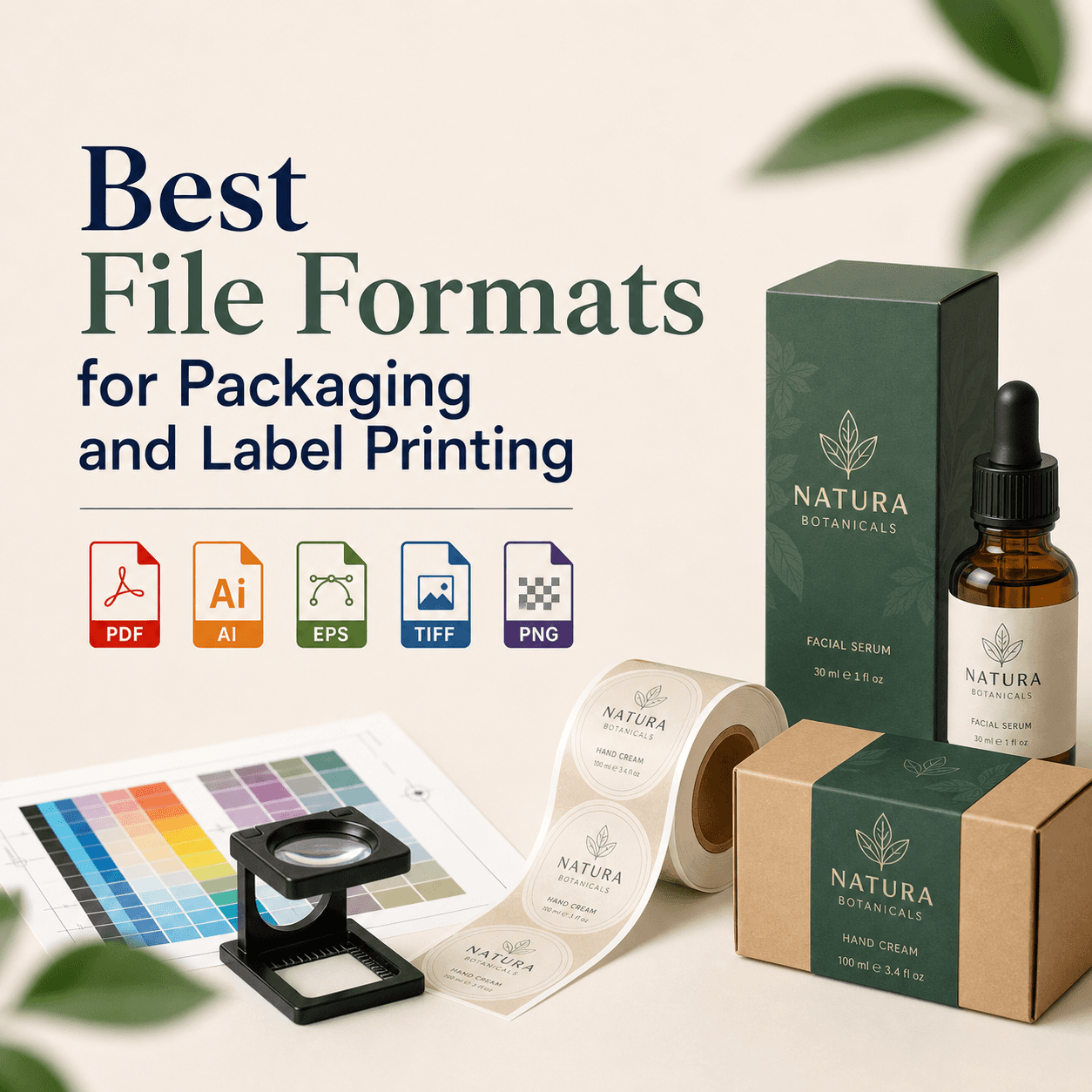
If your printer asks for a specific format, follow it. Many prefer PDF (Print) with bleed and crop marks included, but requirements vary. When in doubt, ask the printer for their spec sheet or template.
A quick note on CMYK vs RGB (because it comes up a lot)
While we’re here: screens use RGB light, and print uses CMYK ink. This doesn’t change bleed or margins, but it can change color appearance.
If your brand colors are important, it’s smart to design with print in mind and consider proofs, especially for packaging and premium stationery.
Why we care about these details at RS Graphic Design
At RS Graphic Design, we’ve been building brand-focused design systems since 2017, and print is one of those areas where small technical choices make a big difference. Bleed, margins, and DPI aren’t “boring setup steps.” They’re the reason your final piece looks clean, confident, and professional in someone’s hands.
When we create print design, packaging, or branded collateral, we treat production details as part of the design, not an afterthought. That’s how you avoid surprises, reduce reprints, and make sure the final result matches what you approved on screen.
FAQs
What happens if I don’t add bleed to my print file?
Without bleed, trimming shifts can expose thin white edges around your design. Even a tiny cut variation is enough. Bleed gives printers extra background to trim safely and cleanly.
Is margin the same as bleed in print design?
No. Bleed extends artwork beyond the cut line and gets trimmed off. Margin, often called the safe area, keeps important text and logos away from the edge to avoid cutting and crowding.
What DPI should I use for printing flyers and business cards?
Use 300 DPI for most standard print items like flyers, business cards, brochures, and packaging labels. It helps images print sharp and avoids visible pixelation when viewed up close.
Can I increase DPI to fix a low-quality image?
Not really. Changing DPI in export doesn’t add real detail if the original image is small or blurry. You need a higher-resolution source image or vector artwork for crisp results.
Do printers always use 3mm bleed?
3 mm is common globally, and 0.125 inch is common in the US, but it’s not universal. Always check your printer’s template or specifications since different products and machines may require different bleed.
Ready to print without the stress?
If you want your next flyer, business card, brochure, or packaging design to come out clean on the first run, we can help. At RS Graphic Design, we don’t just make things look good. We prepare files the right way, double-check the details, and design with real-world printing in mind, so your brand shows up sharp, polished, and professional. Reach out, and let’s create something extraordinary together.
hello@rsgraphicdesign.com