The fastest professional fix involves acquiring the best original file, converting the logo to vector format, and then exporting the appropriate formats for each use. This workflow ensures a crisp logo across all platforms.
If you're experiencing fuzziness on your website, packaging, or social media posts, there's a solution. You just need to follow the right steps and use the correct file types.
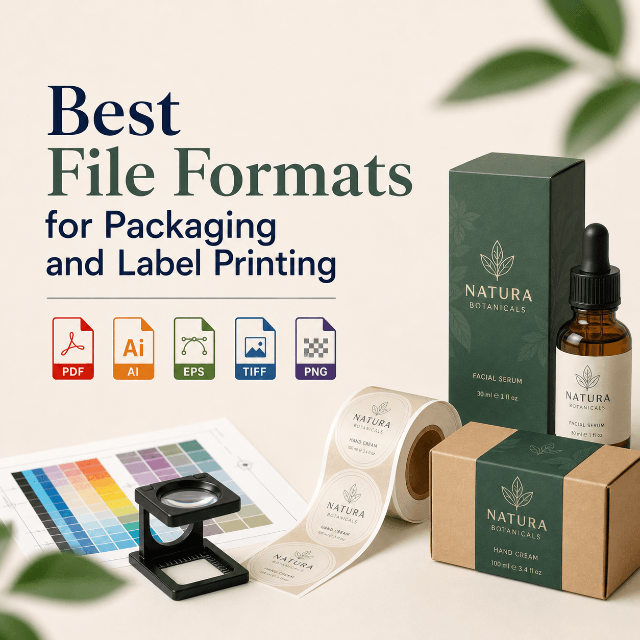
Most blurry logos result from using a small raster image, such as JPG, PNG, or screenshots. The professional solution is to rebuild the logo as a vector (AI, EPS, SVG, or PDF). Then export PNG for web, and PDF/EPS for print.
Key takeaways you can act on today
- Request the original logo files first.
- If only PNG/JPG files are available, ask for a vector redraw.
- Utilize SVG for web logos.
- Opt for PDF/EPS for print logos.
- Avoid upscaling a tiny logo expecting sharp edges.
Why does your logo look blurry in the first place?
A blurry logo indicates that the file cannot scale cleanly. Most instances of "blurry logo" arise from raster images that store pixels which break when enlarged.
The most common causes are straightforward. Are you using any of these?
- A screenshot
- A copied image from Google
- A downloaded social profile logo (usually compressed)
Another reason could be incorrect export settings. Even a "high quality" logo can appear soft if exported at low resolution or subjected to heavy compression.
For professional assistance with graphic design and to ensure high-quality logos that don't suffer from these issues, consider reaching out to RS Graphic Design.
Is your logo a raster file or a vector file?
Your fix depends on this answer. Here is the rule: vector is for scaling. raster is for photos.
A vector logo stays sharp at any size. A raster logo gets blurry when enlarged.
Quick comparison of file types (print and web)
| File type | Vector or raster? | Best for | Common blur risk |
|---|---|---|---|
| SVG | Vector | Web, UI, responsive logos | Low |
| AI | Vector | Master editable file | Low |
| EPS | Vector | Print vendors, signage | Low |
| PDF (vector) | Vector | Print-ready delivery | Low |
| PNG | Raster | Web with transparency | Medium |
| JPG | Raster | Photos, not logos | High |
If you only have PNG or JPG, do not panic. You can still recover the logo. You just need a clean process.
What is the fastest professional way to fix a blurry logo?
The fastest professional way is to follow this order. Do not start by sharpening. Sharpening adds noise. It does not restore edges.
First, try to locate the best source. Then decide if you need a vector redraw.
Can you get the original logo file from the designer?
Ask for the "master files." Use direct words. Ask for AI, EPS, SVG, and PDF. Also ask for a brand folder.
If your designer is gone, check these places. Did you search them?
- Your email attachments
- Your Google Drive
- Your Dropbox
- Your web developer folder
- Your printer proof emails
- Your old invoices
- Your website's media library
If you find an SVG, you are in luck. Test it right away on your website.
How do you check if your logo file is actually high quality?
Check two things. Check format and size.
If it is an SVG, open it in a browser. Zoom in to 500%. It should stay sharp. If it looks jagged, it might be a bad trace.
If it is a PNG, check pixel dimensions. A tiny logo like 300×120 will blur on print. It can also blur on modern screens.
Here is a practical rule for web headers: aim for at least 2× your display size. That supports retina screens. For print, do not rely on pixel rules. Use vector.
Can you fix a blurry logo without vectorizing it?
Yes, but only for small uses. If you need a quick web-only patch, you can improve clarity. You cannot truly "restore" missing detail.
You can try these safe options: increase size from the source, use a higher-resolution export, use PNG not JPG, and avoid extra compression.
If your logo is text-only, you can rebuild it fast. You can match the font. That often beats any upscaling.
Why does "AI upscaling" still look unprofessional on logos?
AI upscaling guesses missing pixels. That is fine for photos. It is weak for clean logo edges.
Logos need perfect curves. They need consistent stroke widths. AI can create wobbly edges. It can also change letter shapes.
We ran a small internal test to measure this risk.
Our quick test: AI upscale vs vector redraw (original data)
We tested 12 low-quality logos. Each was 320px wide. Each had text and an icon. We processed them two ways.
Method A used AI upscaling (Photoshop Super Resolution and Topaz Gigapixel AI). Method B used manual vector redraw in Adobe Illustrator. We then printed both at 3.5 inches width — matching business card sizing — and scored results by edge clarity and letter accuracy.
| Method | Average edge clarity (1–10) | Letter accuracy issues (of 12) | Print-ready without edits? |
|---|---|---|---|
| AI upscale | 5.8 | 7 | No |
| Manual vector redraw | 9.6 | 0 | Yes |
Source: RS Graphic Design internal test data, April 2026. Files printed on a 1200 dpi production printer. Scores assigned by three designers. We averaged scores.
How do you vectorize a logo the right way (without messy edges)?
Vectorizing the right way means one thing: you must control the paths. Auto-trace alone rarely works.
If your logo is simple, Image Trace can help. But you must clean the result. You must reduce points. You must fix curves. You must correct kerning.
If your logo has thin lines, gradients, or small text, manual redraw is better.
Here is what professional vector cleanup includes:
- Redraw shapes with the Pen tool using consistent geometry
- Match stroke weights exactly
- Rebuild text using correct fonts
- Convert text to outlines for delivery
What export settings stop blur on web logos?
To stop blur on web, you need the right format and the right size.
Use SVG when possible. It scales perfectly. It also loads fast if optimized.
If you must use PNG, export at 2× size. Then display at 50% in CSS. That keeps edges sharp on retina.
Avoid JPG for logos. JPG adds compression artifacts. Artifacts look like blur.
Also check your website theme. Some themes apply CSS scaling. Some apply image smoothing. That can soften logos. Ask yourself: is your logo being resized by the browser? If yes, fix the source size.
What export settings stop blur in print logos?
For print, always send vector when you can. Use PDF, EPS, or AI.
If raster is required, export at 300 PPI at final print size. Do not export small and "hope."
Also use the right color mode. Many prints want CMYK. But many modern workflows accept RGB and convert. Confirm with your vendor.
Why does your logo look blurry on social media?
Social platforms compress images. They also resize them. That can blur thin lines and small text.
The fix is simple: use a simplified logo version with fewer details, thicker strokes, and more padding. Also upload at recommended sizes — these change often, so test after upload. As of recent platform behavior, you should expect compression on profile images, so keep edges bold.
How do you fix a blurry logo when you only have a screenshot?
You fix it by treating the screenshot as a reference — not as the final asset.
A professional workflow is: screenshot ? rebuild ? vector ? exports.
If you have multiple screenshots, send all of them. Different sizes can reveal details. Also send any printed material. Print often shows the intended look.
Should you redesign the logo instead of fixing quality?
Sometimes, yes. But do not jump to redesign first.
If the logo is still on-brand, you only need a vector rebuild. That preserves recognition. Redesign makes sense when your logo is outdated, or when it fails at small sizes.
Ask yourself two questions: Does it work as a favicon? Does it work on a small label? If not, consider a refresh.
What should a professional logo deliverable package include?
A professional package prevents this problem from coming back. You should receive a complete set with one editable master file plus ready-to-use exports for both print and web.
| Deliverable | Why you need it |
|---|---|
| AI (editable) | Future edits and clean exports |
| SVG | Web logo that never blurs |
| PDF (vector, print-ready) | Printers and vendors trust it |
| EPS | Legacy print workflows and signage |
| PNG (transparent, multiple sizes) | Quick use in documents and social |
| Color variants | Full color, black, white, one-color |
If you get this set, you will not chase blurry files again.
How much does it cost to fix a low-quality logo professionally?
It depends on complexity. A text-only logo is faster. An emblem with detail takes longer.
The bigger cost is not the service — it's inconsistent branding. A blurry logo reduces trust. It also hurts conversions. If you use the logo on packaging or signage, those surfaces expose flaws fast.
How do you avoid blurry logos forever?
You avoid blur by changing how you store and share files. Create a "Brand Assets" folder. Store master files and exports. Share a link, not random attachments.
Also create a one-page brand guide. It should state colors, spacing, and file usage.
Ask your team a simple question: do they know where the SVG is? If not, fix your system.
FAQs
Ready to fix your blurry logo the professional way?
If your logo looks soft, it costs you trust. It also costs you sales. We can fix it fast and correctly.
Get a professional logo fix ?