How to Modernize an Old Logo Without Losing Brand Identity
Modernizing a logo is a little like renovating a home you grew up in. You want better lighting, cleaner lines, and fewer creaky corners, but you also do not want to erase the memories that make it feel familiar.
The challenge is not just “making it look modern.” The real challenge is updating your visual identity without breaking recognition, trust, and the emotional shorthand your audience already has with your brand.
A good logo refresh should feel inevitable in hindsight. People should look at the updated mark and think, “That’s the same brand, just sharper.” If they think, “Who is this?” you probably changed too much, too fast, or without enough strategy behind it.
Why brands modernize logos in the first place
Most logos do not become “bad.” They become mismatched to where the brand is today.
A logo designed years ago might have been perfect for print but frustrating on mobile. It might look dated next to competitors. Or the company may have expanded into new services and the old symbol no longer fits the story.
Here are a few very common reasons a modernization becomes necessary. First, scalability. If your logo falls apart at small sizes, it will fail in the places that now matter most: social avatars, app icons, favicons, and mobile headers.
Second, consistency. Many older logos have multiple unofficial versions floating around, which slowly weakens brand recognition. Third, relevance. Even strong brands can start to feel visually “stuck” if their look does not evolve with customer expectations.
The best reason, though, is simple. You have grown. Your logo should grow with you.
To achieve this growth and ensure your logo aligns with your current brand identity and future aspirations, seeking professional help from experts such as those at RS Graphic Design can be invaluable.
Start by defining what must never change
Before you sketch a single idea, decide what makes your brand recognizable. This is the part many businesses skip, and it is exactly why some redesigns cause backlash.
Your audience may not be able to explain design principles, but they can absolutely sense when a brand abandons its own identity.
Think of brand identity like a recipe. You can change the plating, refine the technique, maybe even adjust the spice level, but you cannot remove the core ingredients without changing the dish.
Typically, the “never change” elements are one or two of these:
- The primary brand color (or a signature color cue)
- The silhouette or core symbol concept (not every detail, but the idea)
- The name and its readability
- A recognizable typographic personality (for example: sturdy, playful, elegant, technical)
- A brand asset people already associate with you (an icon, a shape, a motif)
If you are not sure what those elements are, look at what customers remember. Scan your reviews, social comments, and how partners refer to you. Recognition lives in repetition.
Audit the current logo like a designer, not an owner
It is normal to be emotionally attached to an old logo. It carried your brand through early wins. But a modernization requires a practical audit. You are not judging the logo’s history. You are judging its performance today.
A useful audit looks at four areas.
First, legibility: does it read clearly at small sizes, at a distance, or in motion?
Second, flexibility: does it work in one color, reversed out, embroidered, or on busy photography?
Third, distinctiveness: could someone confuse it with a competitor in your category?
Fourth, consistency: do you have a clean, official version, or is it a patchwork of files and “close enough” variants?
A quick test that reveals a lot is the “favicon test.” Shrink your logo down to 16x16 or 32x32 pixels. If it becomes a blob, you likely need simplification or a better responsive system.
Modernization is usually simplification, not decoration
When people hear “modern logo,” they often picture something trend-driven. Flat shapes, minimal icons, or generic sans-serif type. But modern does not mean trendy. It means effective in today’s environments.
That usually results in simplification. Not because minimalism is fashionable, but because clarity travels better across screens, materials, and contexts. You remove visual noise, improve spacing, refine geometry, and make typography more readable.
In other words, you make the logo work harder with less effort.
Simplification can include things like smoothing awkward curves, correcting proportions, tightening kerning, removing unnecessary gradients, or creating a more balanced lockup. These are subtle changes, but they can transform how “premium” and confident a brand feels.
Preserve the brand’s “visual DNA”
A strong modernization keeps the DNA while updating the execution. Here are some practical ways to do that without falling into a full rebrand.
If your logo has a recognizable shape, preserve the silhouette even if you redraw it. If your brand is known for a particular color, keep it as the hero color, then modernize the palette around it with better supporting neutrals and accessible contrast.
If your typography feels dated, you can often switch to a newer typeface with a similar personality. For example, you might move from a decorative serif to a contemporary serif that still signals tradition, just with better readability. The trick is to keep one strong “anchor” so your audience stays oriented.
This concept of maintaining a recognizable element while modernizing others relates closely to building your visual DNA, which serves as the foundation of your brand's identity.
Consider a responsive logo system (not just one logo)
One of the biggest updates modern brands make is moving from a single rigid logo to a small system: a primary logo, a stacked version, and a simplified icon. This is not overcomplicating. It is acknowledging reality. Your logo will appear in dozens of sizes and contexts, and one configuration cannot win everywhere.
A responsive system might include:
- A primary horizontal lockup for website headers and signage
- A stacked version for square spaces and social posts
- A standalone icon or monogram for avatars and favicons
- A one-color version for print, embossing, and cost-effective applications
That system is a modernization all by itself because it increases consistency and makes your brand easier to deploy correctly.
Modernize typography with care (type is where identity often lives)
In many older logos, the typeface is doing most of the identity work. Change it carelessly and the brand suddenly feels like a different company.
If your current typography is a big part of recognition, consider evolution rather than replacement. Maybe the letterforms can be custom-refined, the spacing improved, or the weight adjusted. Sometimes you keep the same general style but rebuild it as a custom wordmark so it feels owned and distinctive.
Also pay attention to how your type behaves in digital contexts. Is it still readable on small screens? Do thin strokes disappear? Do tight curves turn muddy in low-resolution environments? A good modernization anticipates where your logo will live, not where it used to live.
Update color for modern accessibility and consistency
Color modernization is one of the safest ways to refresh a logo without losing identity, especially when you keep the main hue and refine everything around it.
Older color palettes often suffer from inconsistent reproduction across print and screen, or they lack enough contrast for accessibility standards.
A smart update may involve slightly shifting the color for better vibrancy on screens, defining official HEX/RGB/CMYK/Pantone values, and building a supporting palette that feels contemporary. Even if your logo stays the same shape, tighter color discipline makes the brand feel more modern immediately.
One important note: do not pick colors based purely on trend reports. Pick them based on what your brand needs to communicate and what your customers already associate with you.
Know the difference between a logo refresh and a full rebrand
Not every business needs a rebrand. Many just need a logo refresh plus a small system and guidelines. The difference matters because it affects risk, cost, timeline, and how you communicate changes.
A refresh keeps the same identity but improves it. A rebrand often changes positioning, messaging, visual language, and sometimes even the brand name.
If your customers like you and recognize you, a refresh is usually the smarter move. If your business model, audience, or reputation has fundamentally changed, a rebrand may be more appropriate.
If you are unsure whether to pursue a full-scale rebranding or just a minor logo redesign, ask this: “If we keep our core identity but polish it, do we solve the problem?” If yes, you are likely in refresh territory.
Prototype in real-world use before you commit
A logo does not live on a white canvas. It lives on websites, packaging, invoices, social profiles, storefronts, merch, and sometimes very unglamorous places like email signatures and PDFs.
Before finalizing, mock it up in the contexts that matter most for your business. Put it on a mobile header. Place it on a busy product photo. Print it in black and white. Shrink it down. Blow it up. Try it on dark and light backgrounds. If your logo does not perform across these, it is not ready.
This stage is also where you can see whether you kept enough brand DNA. If the new mark looks “cool” but feels disconnected in real use, it is a warning sign.
Manage the rollout so customers do not feel blindsided
Even a perfect modernization can land poorly if the rollout is sudden and unexplained, especially if you have a loyal audience. People do not like feeling like something familiar was swapped overnight.
A smoother rollout usually includes a short announcement that frames the update correctly: the brand is the same, the logo is simply optimized for today.
If the changes are subtle, you can keep it light. If the changes are more noticeable, show the reasoning: improved readability, better digital performance, cleaner consistency.
In some cases, a brief transition period helps. You might update the website first, then packaging, then signage. The goal is to avoid a messy situation where five versions of the logo exist in the wild at the same time.
Common mistakes that make a modernization feel like a different brand
Most logo modernizations fail in predictable ways. They chase trends, remove distinctive features, or “sanitize” the brand until it looks like every competitor.
A few pitfalls to avoid are making the logo too generic, switching to an overused font without customization, dramatically changing the color palette, or altering the symbol so much that recognition disappears.
Another big one is designing for aesthetics only, without considering how the logo functions across real formats. The safest approach is to be brave in craftsmanship, but conservative in identity. Upgrade quality, not personality.
A practical modernization process you can follow
If you want a straightforward approach that works for most businesses, follow this sequence.
First, clarify the objective: what problem are you solving (legibility, scalability, dated look, inconsistency)? Next, list the brand elements that must remain recognizable. Then create a few evolution concepts, not wild reinventions.
Test them in real-world mockups. Gather feedback from people who represent your audience, not just internal opinions. Finalize the logo system, then document it in basic brand guidelines so the refresh actually stays consistent. This is how you get a modernization that feels confident, not confusing.
Where RS Graphic Design fits into this (and why it matters)
At RS Graphic Design, we have been doing this kind of work since 2017: taking what is already valuable in a brand and elevating it with strategic, detail-focused design.
Logo modernization is not about ripping things apart. It is about collaboration, precision, and knowing exactly what to refine so your identity stays intact while your presentation catches up with your ambition.
We combine strategic insight with creative execution across branding, print, packaging, web design, vector illustration, and custom graphic design. That matters because a logo is not an isolated asset. It is the cornerstone of everything else your audience sees, from a website header to a packaging label to a social profile icon. When it is modernized correctly, the rest of your brand instantly feels more consistent and more professional.
FAQs
How do I know whether my logo needs a refresh or a full redesign?
If customers still recognize and trust your brand, a refresh is usually enough. If your audience, positioning, or services have fundamentally changed, a full redesign or rebrand may be the better option.
Will modernizing my logo hurt brand recognition?
It can, but only if you change the key recognition cues too aggressively. Keeping your visual DNA, like core color or silhouette, while improving clarity and versatility usually strengthens recognition instead.
How long does a logo modernization typically take?
A proper modernization usually takes a few weeks, depending on concept exploration, revisions, and the number of final deliverables. Faster is possible, but skipping testing and guidelines often creates long-term inconsistency.
What files should I receive after a logo refresh?
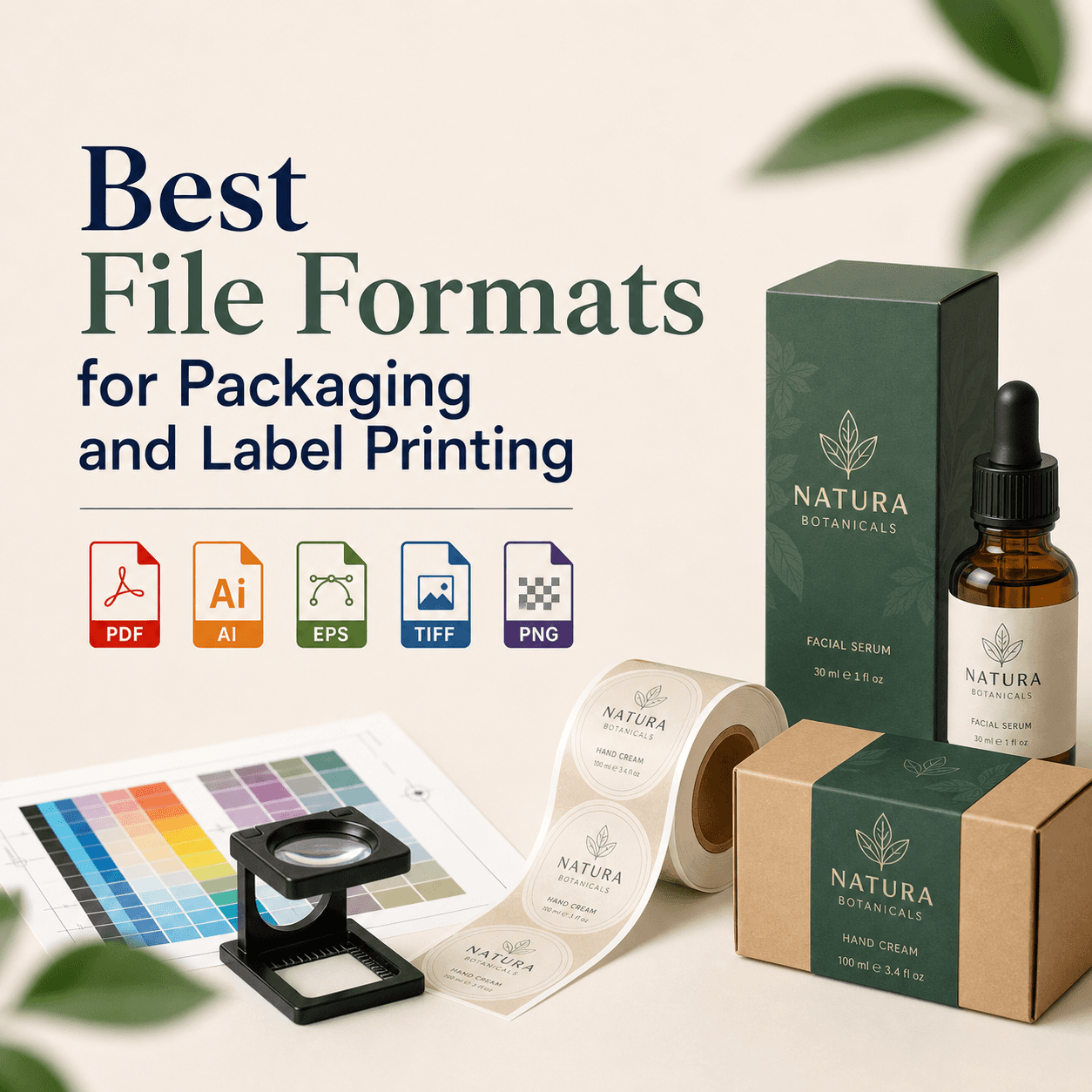
You should receive vector files (AI, EPS, SVG), web-ready files (PNG, JPG), and variations like one-color and reversed versions. Ideally, you also get basic brand guidelines to keep usage consistent.
Can I modernize my logo while keeping the same symbol?
Yes, and it is often the smartest approach. You can redraw the symbol for cleaner geometry, refine spacing and typography, and build a responsive system while preserving the same core idea people recognize.
Ready to modernize your logo without losing what makes it yours?
If your logo feels a little stuck in the past, that is not a failure. It is a sign your business has evolved. At RS Graphic Design, we help brands modernize with care, not chaos, keeping what your audience already trusts while upgrading the quality, clarity, and consistency everywhere your logo appears. If you want a refresh that still feels like you, we would love to collaborate and build something extraordinary together.
Work With Us