Common Print Design Mistakes Businesses Make
Print is one of the few places your brand becomes “real.” Someone holds it, keeps it on a desk, pins it on a board, or tosses it in a bag. And that’s exactly why print design mistakes sting a little more than digital ones. A typo in an Instagram caption is gone in a day. A typo on 5,000 brochures is a budget line item you feel.
The good news is that most print problems aren’t mysterious. They usually come from a handful of repeat mistakes: wrong file setup, unclear hierarchy, weak production choices, or skipping the unglamorous details like bleeds and proofreading.
In this guide, we’ll walk through the most common print design mistakes businesses make, how they show up in the real world, and how to avoid them before they cost you time, money, and credibility.
Mistake #1: Designing for the screen, not the press
A design that looks crisp on a backlit screen can print darker, flatter, or muddier than you expect. Screens display light. Paper reflects it. That single difference changes everything: contrast, vibrancy, readability, and how colors feel.
This often shows up when businesses approve a PDF on a laptop, then feel surprised when the final print looks “different.” It is different. Print needs its own thinking, especially around contrast, color (remember to consider RGB vs CMYK color formats), and legibility.
A simple fix is to review a physical proof (or at least a calibrated proof) and build print-safe contrast into your design from the start, not at the end. For expert guidance on these aspects of print design and to avoid common pitfalls, consider seeking help from professionals like RS Graphic Design.
Mistake #2: Using RGB instead of CMYK (and hoping it “just works”)
RGB is for screens. CMYK is for most print. If you design in RGB, some colors will shift when converted for press, especially bright blues, greens, and neons. Brands often discover this the hard way when their “electric” color becomes dull, or their logo color changes across materials.
If color accuracy matters, start in CMYK and use a proper color profile your printer recommends. For brand-critical colors, consider Pantone (spot colors) or build a documented print color system so your palette stays consistent across vendors.
Mistake #3: Skipping bleed, trim, and safe area setup
This is one of the most common “why does my flyer have white edges?” issues.
Here’s the practical reality: paper gets trimmed in stacks, and cuts can shift slightly. If your background color or image goes right to the edge, you need bleed (usually 3mm or 0.125") so trimming doesn’t expose unprinted paper. And if text is too close to the edge, it can look cramped or, worse, get clipped.
When we set up print files, we think in three zones: bleed (extra), trim (final size), and safe area (where important content lives). It’s simple, but it saves projects.
Mistake #4: Low-resolution images that look fine… until they don’t
If you’ve ever seen a brochure with fuzzy photos or pixelated logos, this is why. Web images are often 72–150 DPI. Print generally needs 300 DPI at final size. Stretching a small image to fill a banner or an A4 flyer is a guaranteed quality drop.
Logos are another big one. If you place a PNG logo instead of a vector file (AI, EPS, SVG, or a vector PDF), edges can print soft and unprofessional.
A good rule: if it’s a logo or illustration, keep it vector. If it’s a photo, make sure it’s high-resolution at the size it will print.
Mistake #5: Fonts that don’t print well (or don’t print at all)
Some fonts look stylish on screen but become hard to read in print, especially at small sizes. Thin strokes disappear. Tight spacing closes up. Decorative fonts become a strain.
Then there’s the technical issue: missing fonts. If fonts aren’t embedded, outlined, or packaged properly, printers can get substitution fonts that change your layout.
The best approach is choosing print-friendly typefaces, checking readability at actual size, and exporting press-ready PDFs with fonts embedded (or outlining where appropriate, especially for display type).
Mistake #6: Overcrowding the design with too much information
A common business instinct is to “make the most of the space,” especially on flyers, brochures, and business cards. The result is often a wall of text, too many icons, too many offers, too many calls to action.
Print is scanned quickly. If people can’t find the main point in two seconds, you’ve lost them.
A better approach is to simplify and prioritize. Make one primary message obvious, support it with a few key details, and let whitespace do its job. You are not wasting space. You are buying clarity.
Mistake #7: Weak hierarchy (everything looks equally important)
If your headline, body text, phone number, and offer are all similar size and weight, your reader has no path. They don’t know where to look first, so they often stop looking.
Hierarchy is how you guide attention. It’s built with type size, weight, spacing, contrast, and layout. Great print design feels effortless because your eyes naturally land on the right elements in the right order.
A quick test: blur your design and look at it from arm’s length. Can you still tell what the piece is about? If not, hierarchy needs work.
Mistake #8: Not proofing like it’s going to print (because it is)
Proofreading is not glamorous, but it’s one of the highest ROI steps in print. The most expensive errors are often simple: wrong phone number, outdated address, inconsistent pricing, missing social handles, or a QR code that goes to a dead link. And once it’s printed, fixing it means reprinting.
Proof like a pro: check content, then check it again after layout changes. Print it on a regular printer to catch spacing issues. Have a second person review it. And always verify details that change, like dates, URLs, and offers.
Mistake #9: QR codes that don’t scan reliably
QR codes are useful, but they are easy to mess up. Common issues include printing them too small, placing them on busy backgrounds, or reducing contrast so scanners struggle. Sometimes the quiet zone (the blank margin around the QR code) gets clipped, and scanning fails.
If you use QR codes, test them on multiple phones, keep strong contrast (dark code on light background), and print them large enough for real-world use. Also make sure the destination page is mobile-friendly and loads fast.
Mistake #10: Ignoring paper, finishes, and tactile experience
Design does not end at the PDF. In print, material choices communicate quality. A matte soft-touch finish feels premium. A thin, glossy flyer can feel disposable. Uncoated paper can make colors look more muted but more natural.
Businesses often design without deciding the stock and finish, then pick “whatever is cheapest” at the end. That can work for some campaigns, but it can also undermine the brand message you worked so hard to build.
If the piece is meant to impress, choose materials intentionally. Paper weight, texture, coating, lamination, foil, embossing, and spot UV all change how your design is perceived.
Mistake #11: Using “rich black” and small text the wrong way
Black sounds simple until you print it. A deep, rich black background often uses a mix of CMYK values. But small black text should usually be 100% K only, because mixing inks can cause slight misregistration that makes text look blurry.
Businesses sometimes set body text in a rich black mix, then wonder why it looks fuzzy. Or they use a single-channel black for large backgrounds, then wonder why it looks washed out.
The fix is straightforward: use rich black for large fills (based on printer guidance) and K-only for small text unless your printer explicitly advises otherwise.
Mistake #12: Not accounting for folds, spines, and panel shifts
Brochures, folders, and packaging are where print gets real technical. A trifold brochure needs correct panel widths because paper thickness affects how it folds. A booklet needs a spine calculation. Packaging dielines need precision, or your artwork might land on a flap, seam, or glue area.
This is where businesses lose money fast, usually because they designed the artwork first and tried to “fit it” onto a template later.
For anything folded or die-cut, start with the printer’s dieline or a professionally built one, then design within it carefully.
Mistake #13: Sending the wrong file type (or the right type exported incorrectly)
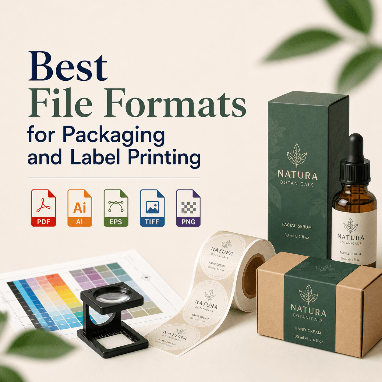
A “print-ready file” is not just any PDF. Printers typically want a PDF with proper bleed, crop marks if needed, embedded fonts, correct color mode, and images at the right resolution. Some jobs require PDF/X standards.
Businesses often send editable source files without packaging, or they export a PDF optimized for email, which compresses images and ruins quality.
If you are unsure, ask your printer for specifications and follow them. It prevents back-and-forth and avoids surprise results.
Mistake #14: Inconsistent branding across print materials
A business card, brochure, label, and poster should feel like they belong to the same brand family. What often happens is that different pieces get designed by different people, in different years, with different logos and colors. Over time, the brand looks scattered.
Consistency builds trust. It tells customers you are established and detail-oriented. If your print materials don’t match, your audience may not say it out loud, but they feel it.
The fix is a simple brand system: logo rules, color values for print, typography choices, layout patterns, and templates for recurring materials.
Mistake #15: Not doing a realistic print test before full production
When budgets are tight, it’s tempting to skip proofing. But a small proof can prevent a large mistake.
Even a quick prototype, printed on a desktop printer, helps you catch issues like margins that feel too tight, text that is too small, or a design that looks great on screen but reads poorly on paper.
For larger runs or brand-critical items, request a proper press proof or a color-accurate proof from your printer.
A simple pre-print checklist (that saves a lot of pain)
You don’t need to become a print technician, but you do need a quick system before anything goes to production. Here’s a short checklist we use to catch the most expensive problems:
- Confirm size, bleed, and safe margins match printer specs
- Check color mode (CMYK or Pantone) and confirm brand colors
- Verify images are 300 DPI at final size; logos are vector
- Proofread twice, then test QR codes, URLs, phone numbers, and addresses
- Export a press-ready PDF with embedded fonts and correct settings
Final thoughts
Print design mistakes are rarely about “bad taste.” They’re usually about missing steps, unclear priorities, or designing without production in mind. Once you understand how paper, ink, trimming, and finishing work, your print materials stop being a gamble and start becoming a reliable extension of your brand.
And if you want your print pieces to look as good in someone’s hand as they do on your screen, it helps to have a team that lives in both worlds: creative and technical.
FAQs
1) What is the most common print design mistake businesses make?
Skipping proper print setup. Missing bleed, incorrect color mode, and low-resolution images are the top culprits. These issues often look fine on screen but fail immediately when printed.
2) Should I design in RGB or CMYK for printing?
Design in CMYK for most print projects. RGB colors can shift when converted for press, especially bright tones. If brand color accuracy matters, ask about Pantone options.
3) What resolution do images need for high-quality printing?
Aim for 300 DPI at the final printed size. Using web-sized images or scaling small photos up leads to blurry, pixelated prints that look unprofessional in brochures and packaging.
4) Do I really need bleed on flyers and business cards?
Yes. Bleed prevents white edges when the printer trims stacks of paper. Even slight cutting shifts can expose unprinted areas if your background doesn’t extend past the trim line.
5) Why do my printed colors look darker than on my screen?
Screens emit light; paper reflects it. That difference reduces vibrancy and changes contrast. Without proofing and proper color profiles, prints often look darker or more muted than expected.
CTA (PSA style)
If you’re about to print brochures, packaging, labels, business cards, or anything that represents your brand in the real world, please don’t “just send the file and hope.” We’ve seen how one small setup mistake can turn into a costly reprint. At RS Graphic Design, we work collaboratively, obsess over the details, and build print designs that actually production teams can run with confidently. If you want your next print run to look sharp, feel premium, and stay consistent with your brand, let’s create it together.
hello@rsgraphicdesign.com