How to Design Print Materials That Actually Convert Customers
Print isn’t dead. Bad print is.
The truth is, print can still outperform a lot of digital marketing because it’s physical, harder to ignore, and it sits in someone’s space long after a scroll would have disappeared. But that only happens when the design has a clear job: guide a real person toward a specific action.
If your brochure looks “nice” but doesn’t get calls, if your flyer gets glanced at then trashed, or if your packaging is pretty but doesn’t sell, it’s usually not a printing problem. It’s a conversion problem.
In this guide, we’ll walk through how to design print materials that do more than represent your brand. They persuade, build trust fast, and turn attention into customers.
Start with the one conversion you actually want
Most print fails because it tries to do everything. A single piece attempts to introduce the brand, list every service, show every product, explain the backstory, include ten social links, and still ask for a sale. The reader’s brain responds the way it always does when something is crowded. It shuts down.
Before you touch fonts or colors, define one primary action. Just one.
If it’s a flyer, the action might be “Book a free estimate.” If it’s a menu insert, “Try the new combo.” If it’s a trade show handout, “Scan to get the spec sheet.” If it’s packaging, “Choose this instead of the similar item next to it.”
Everything in your design should serve that one action. If an element doesn’t support it, it’s decoration, and decoration is expensive when you’re paying for ink and paper.
A helpful way to lock this in is to finish this sentence: “After reading this, we want them to ____.” If you can’t finish it in a few words, the piece will be unclear.
For those looking for professional help in creating impactful print designs that convert, RS Graphic Design offers expert services tailored to meet your specific needs.
Know where this print piece will live (and design for that moment)
Print doesn’t exist in a vacuum. A postcard is viewed at a mailbox. A brochure is read in a waiting room. Packaging is judged from a shelf, often from a distance, and often next to competitors. A business card is seen during a quick conversation, not a quiet study session.
That context changes everything: size, headline length, contrast, paper choice, even how much text is reasonable.
Ask a few simple questions upfront. Where will it be picked up? How much time will someone give it? Will they be standing, walking, or seated? Will they see it in good lighting? Will it compete with other materials?
If you’re designing a retail flyer for a crowded counter, you need bold hierarchy and a fast message. If you’re designing a premium tri-fold brochure for high-ticket services, you can slow down the pace, use more whitespace, and let the story unfold.
Designing for the real world is how print starts converting again.
Use messaging hierarchy, not “equal importance” layout
Conversion-based print has a clear reading path. Your job is to decide what gets noticed first, second, and third.
When everything is the same size, weight, and proximity, nothing feels important. That’s when people skim and move on.
A practical hierarchy for most print materials looks like this:
- Headline: the main promise or hook
- Subhead: a clarifier that makes the headline believable
- Key benefits: a tight list or short blocks that answer “why you?”
- Proof: reviews, numbers, logos, guarantees
- Call to action: one clear next step, repeated logically
- Details: address, hours, fine print, terms, secondary info
You don’t always need all of these, but you do need a deliberate flow. The eye should land where you want it to land, and the message should get easier, not harder as they read.
Understanding these principles is part of mastering graphic design, which can significantly enhance the effectiveness of your print materials.
Write a headline that earns attention in 2 seconds
Print is judged instantly. Your headline has to work even if someone only reads that one line.
Most headlines are either too vague (“Quality You Can Trust”) or too generic (“Best Services in Town”). They don’t give the brain a reason to continue.
Strong print headlines usually do one of these things:
They offer a clear benefit, address a problem, create a specific curiosity gap, or make a bold but believable promise. And they do it without trying to sound clever.
Here are a few examples of headline directions that tend to convert:
“Get a New Roof Estimate in 24 Hours.”
“Fresh Meals in Under 10 Minutes.”
“Stop Overpaying for Printer Ink.”
“Packaging That Makes Your Product Feel Premium.”
Notice how those headlines feel measurable. Your reader can imagine the outcome. That’s the difference between branding and conversion.
If your piece is for brand awareness, you can still use this approach. Awareness doesn’t mean vague. It means memorable, clear, and easy to repeat.
Benefits beat features, especially in print
Print doesn’t have the luxury of interactive explanations. You can’t rely on a long web page to do the heavy lifting. That means you should focus your limited space on what people care about most: the outcome.
Features are what your product is. Benefits are what it does for them.
“100% recyclable material” is a feature. “Feels premium, ships safely, and customers love unboxing it” is a benefit.
A simple way to convert features into benefits is to ask “so what?” until you reach something human.
“24/7 support.” So what? “You’re never stuck waiting until morning.”
“High-resolution printing.” So what? “Your photos look sharp, not muddy.”
“Custom packaging.” So what? “Your product stands out and gets chosen.”
When people can quickly see themselves on the other side of the purchase, conversion becomes easier.
Design for trust: proof is the conversion multiplier
Print can feel more credible than digital, but only if you support your claims. Trust is often the difference between “looks nice” and “gets results.”
The best proof elements for print are short and highly specific:
A one-sentence testimonial with a name and location. A star rating. A “trusted by” strip of recognizable client logos. A small badge for certifications or guarantees. A concrete stat like “1,200+ installs completed” or “serving this area since 2017.”
Keep proof scannable. In print, long testimonials rarely get read. One strong line can outperform a paragraph.
Also, place proof near your key claims and near your call to action. That’s where doubt tends to spike.
Make the call to action impossible to miss (and easy to do)
A CTA in print isn’t just a phrase. It’s a mini user experience.
If the CTA is “Call now,” the phone number should be large enough to read easily and repeated where it matters, not hidden in the footer.
If the CTA is “Scan to book,” the QR code should be big enough to scan quickly, placed on a clean background, and paired with a short instruction like “Scan to schedule in 30 seconds.”
If the CTA is “Visit us,” the address should be clear and you should consider adding a small map snippet if the location isn’t obvious.
Also, don’t pile CTAs. Pick one primary action. If you must include a secondary action, it should be visually secondary too.
A good print CTA answers three questions without making the reader work:
What do you want me to do, how do I do it, and why should I do it now?
Use typography that reads fast, not typography that looks fancy
Print gives you more control than screens, but it also punishes bad type choices.
Fonts should be chosen for readability, consistency, and brand tone. A luxury brand can use refined serif typography, but it still needs generous spacing and contrast. A local service flyer needs clarity first, style second.
A few practical guidelines that keep print readable:
Body text should be comfortably sized. Line spacing should be airy enough to breathe. Contrast should be strong. Avoid placing small text on busy backgrounds. Keep the number of font families limited so the piece feels cohesive.
Most importantly, use typographic hierarchy to do the heavy lifting so the reader doesn’t feel like they’re “studying.” They should feel guided.
Color and contrast: design for real lighting, not your monitor
A common mistake is designing print materials on a bright screen, then being disappointed when the printed result looks darker or flatter.
Print is reflective, not emissive. It behaves differently.
Strong conversion design usually relies on high contrast, purposeful color use, and clear separation between sections. If your background is dark, your type needs to be bright and thick enough to hold up in print. If you’re using brand colors, make sure they translate well in CMYK, not just RGB.
If your offer is important, don’t whisper it in a low-contrast box. Give it space, clarity, and a visual cue that says “this matters.”
Layout that converts is often simpler than you think
A clean grid, consistent alignment, and enough whitespace can make a piece feel premium instantly. And premium often converts better because it signals competence before the reader even starts reading.
Whitespace isn’t wasted space. It’s what makes the important things look important.
If you’re cramming in content because you “need to say everything,” consider creating two pieces instead. One for attention and action, another for details. Conversion improves when each piece has a clear role.
Use images that support the sale, not generic filler
Stock images aren’t automatically bad. Generic images are.
Your visuals should do one of three things: show the product clearly, show the outcome, or show the customer experience.
For example, a gym flyer converts better with real photos of the space or trainers than with a random fitness model. A restaurant menu insert converts better with a real photo of the featured item than with an abstract background pattern.
If you use a hero image, make sure it doesn’t fight your headline. Leave room for text, and avoid backgrounds that reduce contrast.
Packaging is even more visual. The “image” is often the structure, the label layout, the finish, and how it looks from six feet away. Design for that shelf moment.
Choose paper and finishes that match the promise you’re making
In print, the material is part of the message.
A premium brand printed on thin glossy paper sends mixed signals. A minimalist brand on overly shiny stock can feel off. A rugged outdoor brand on soft-touch velvet might feel inconsistent.
Your paper and finishes should reinforce what you want people to feel: trust, quality, affordability, luxury, durability, eco-consciousness, or fun.
If conversion is the goal, here’s the real question: will the physical feel increase confidence enough to justify the cost? Often, the answer is yes, especially for high-ticket services, luxury products, and packaging.
Even small choices matter. A thicker business card tends to get kept longer. A matte finish can reduce glare and improve readability. Spot UV can draw attention to the brand name or CTA if used with restraint.
Don’t skip print production basics (they affect conversion too)
A gorgeous design that prints poorly can hurt trust instantly. People often interpret print quality as business quality.
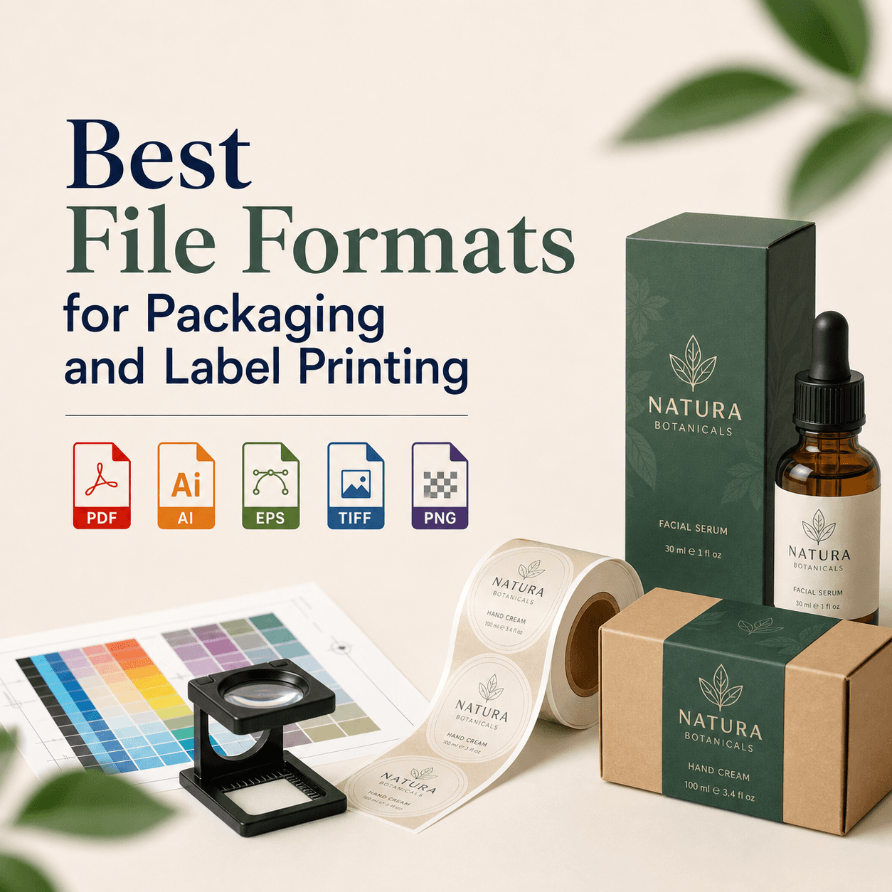
Make sure your design accounts for bleed and safe margins so nothing important gets chopped. Use high-resolution images so they don’t pixelate. Confirm CMYK conversion, especially for brand colors. Proofread like it’s your last chance, because in print, it usually is.
Also, test your QR code on multiple phones before you send to print. It sounds obvious, but it’s one of the most common real-world failures.
Build consistency across your print materials
Conversion compounds when your materials look like they belong to the same brand. If your business card looks modern, your brochure looks dated, and your packaging looks like a different company, you lose the “they’ve got it together” signal.
Consistency doesn’t mean everything looks identical. It means everything feels related. Use a cohesive system: typography rules, spacing, colors, photo style, icon style, and tone of voice.
This is where branding and conversion stop being opposites. A strong brand system makes conversion easier because people recognize you, trust you faster, and feel less friction saying yes.
A simple pre-print checklist (so you don’t waste money)
Before you hit “approve,” take five minutes and audit your piece like a customer would. Ask yourself:
- Does the headline make sense instantly?
- Is the main offer obvious?
- Is there one clear CTA?
- Is the contact method easy?
- Do we show proof?
- Does it look credible from a quick glance?
- Will it still read well under normal lighting?
If you can confidently answer yes, you’re not just designing something pretty. You’re designing something that sells.
Why this approach works (and how we think about it at Rs Graphic Design)
At Rs Graphic Design, we’ve believed since day one that design is only successful when it delivers real outcomes. Since 2017, we’ve built our work around strategic thinking and meticulous execution, whether it’s branding, print design, packaging, web design, vector illustration, or custom graphics that need to perform in the real world.
When we design print, we don’t start with trends. We start with the goal, the audience, and the moment your customer will actually interact with the piece. Then we build a design system that looks bold, feels on-brand, and guides action naturally.
That mix of creativity and precision is what turns print into a true sales tool.
FAQs
How do I know if my print design is actually converting?
Track one main action tied to the piece, like calls, QR scans, or coupon redemptions. If results are low, review clarity, offer strength, proof, and how easy the CTA is to complete.
What print materials convert best for small businesses?
It depends on your customer journey, but postcards, flyers with a clear offer, brochures for high-ticket services, and strong packaging often perform best. The key is matching the piece to the buying moment.
Should I include a QR code on every print piece?
Only if it supports the main CTA. A QR code works well when it leads to one specific next step, like booking, a quote form, or a product page. Make it large, clear, and test it.
How much text should I put on a flyer or brochure?
Less than you think. Use a headline, short benefit sections, and proof. If you need lots of detail, consider a two-step approach: print for attention and action, then link to a page for depth.
Does paper quality really affect conversion?
Yes. Paper stock and finishes change how trustworthy and premium your brand feels. For high-value offers, better materials can raise confidence and increase response rates enough to justify the cost.
What’s the biggest mistake people make with print design?
Trying to say everything at once. Too many messages and too many CTAs create confusion. A single clear goal, strong hierarchy, and proof will almost always outperform a crowded “kitchen sink” layout.
Ready to make your print materials sell, not just look good?
If you’re investing money into printing, it should bring money back. At RS Graphic Design, we don’t design for decoration. We design for decisions. If you want brochures, flyers, packaging, or branded print systems that feel premium and convert confidently, we’d love to collaborate and build something that truly moves your audience to act.
hello@rsgraphicdesign.com