Professional Logo Redesign Process (Behind the Scenes)
A logo redesign may seem straightforward at first glance. You see the “before,” the “after,” and perhaps a quick mockup on Instagram. However, a professional redesign is rarely just about aesthetics. It’s a strategic business decision, guided by thorough research, tested in real-world scenarios, and refined until the outcome feels inevitable.
At Rs Graphic Design, we approach logo redesigns with the same seriousness as any major brand challenge: through collaboration, extensive research, and an unwavering attention to detail. Below is an insight into our behind-the-scenes process, explained in simple terms, so you know exactly what transpires from your initial inquiry to receiving a logo that you’ll be proud to display everywhere.
When a logo redesign is actually the right move
Not every brand requires a redesign. Sometimes, all you need are better usage guidelines, cleaner files, or a consistent system. However, a redesign typically makes sense when your logo is causing friction.
That friction can manifest in several ways: the logo appears outdated compared to modern competitors, it doesn't scale well at smaller sizes, it looks inconsistent across various social profiles, or it no longer accurately represents what your business does today. We often encounter situations where a redesign is necessary due to business expansion into new services, shift towards premium pricing, targeting of a new audience, or merger with another company.
Ultimately, a redesign is justified when it aligns with and supports larger objectives such as enhancing trust, clarity, memorability, and conversion across various touchpoints.
Step 1: Brand discovery (the part most people skip)
The first thing we do is not open Illustrator. We start with discovery, because design without context is just decoration.
We’ll ask questions like: What do you sell, really? What do customers choose you for? What objections show up in sales calls? Where does your brand currently feel inconsistent? What does “professional” mean in your industry, and where do you want to match that or intentionally break it?
We also gather the practical stuff: existing brand assets, past logo files, usage scenarios, and a list of places your logo must work (website header, packaging, uniforms, app icon, invoices, social avatars, vehicle decals, and so on). This is where we define constraints, and constraints are what make good design possible.
Deliverable outcome: a clear direction and success criteria, so we’re not designing based on opinions alone.
Step 2: Brand audit (what’s working, what’s hurting)
Next, we audit your current logo and brand presentation. We look at it the way a customer would, fast and without mercy.
We evaluate legibility, contrast, scalability, alignment, visual balance, uniqueness, and whether the logo matches your brand personality. We also check technical issues: inconsistent spacing, weird curves, mismatched stroke weights, poor kerning, and version chaos (five different logos floating around in different formats).
Then we audit your competitors. Not to copy, but to avoid the most common trap in logo redesign: blending in. If everyone in your space uses the same icon style and the same colors, we look for a smart way to stand apart while still looking credible.
Deliverable outcome: a list of issues to fix and opportunities to leverage.
Step 3: Strategy snapshot (your logo’s job description)
Here’s a line we repeat often: a logo is not the brand, but it is a highly visible tool of the brand. So we clarify what the tool must do.
We define your logo’s role using a strategy snapshot. This includes your brand attributes (for example: confident, friendly, premium, minimal, technical, playful), the tone you want to project, and the brand story you want people to feel in two seconds.
We also decide what type of redesign you need:
- Logo refresh: subtle modernization while keeping recognition high
- Logo evolution: noticeable improvement with the same “core identity”
- Logo overhaul: a new direction when the old identity is limiting growth
This is also where we align on risk level. Some brands want a safe evolution. Others want a bold repositioning. Both are valid, but the process and presentation should match.
Step 4: Concept exploration (from sketches to directions)
Now we design, but we don’t start with polished options. We start with exploration.
We sketch quickly, because sketching prevents us from getting emotionally attached to one idea too early. We test symbols, letterforms, negative space, and structure. We try the obvious routes and then push past them. We look for concepts that can carry meaning without becoming complicated.
Once a few strong ideas emerge, we move into digital draft mode. At this stage, the goal is not perfection. The goal is to create clear directions that can be evaluated against the strategy snapshot.
What we’re checking early: Does it read fast? Does it look stable? Does it feel like your brand? Does it scale? Does it look distinct in your market?
Step 5: Typography, geometry, and the invisible details
This is where professional logo redesign starts to show.
We refine typography because type is often the loudest signal of brand personality. A slight change in weight, spacing, or letter shape can take a logo from “generic” to “credible.” We adjust kerning, optical alignment, and proportions. We also consider whether custom lettering is worth it for uniqueness.
Then we refine geometry and structure. Even logos that look “freeform” are usually built on a disciplined system: consistent angles, intentional curves, and repeatable shapes. We make sure the logo feels balanced at a glance, not just when you zoom in at 400%.
We also consider how the logo behaves in real use: horizontal and stacked layouts, icon-only versions, small favicon sizes, and one-color printing. A redesign that only looks good on a portfolio page is not a redesign, it’s a poster.
Step 6: Color exploration (and why we don’t pick colors randomly)
Color is not decoration. It’s positioning.
We test color based on your audience, industry expectations, and brand personality. Sometimes the right move is to modernize your existing color so you keep recognition. Other times, a color shift is necessary because your current palette looks cheap, untrustworthy, or too similar to competitors.
We check accessibility contrast for key uses. We test how colors appear on screens and in print. We also build a palette system so you have flexibility, not just “one blue.”
Important note: many logos need to work perfectly in black and white first. If it doesn’t, the logo is relying on color to do the heavy lifting, and that usually causes issues later.
Step 7: Mockups and real-world testing (the “does it actually work?” phase)
This is our favorite phase because it turns opinion into evidence.
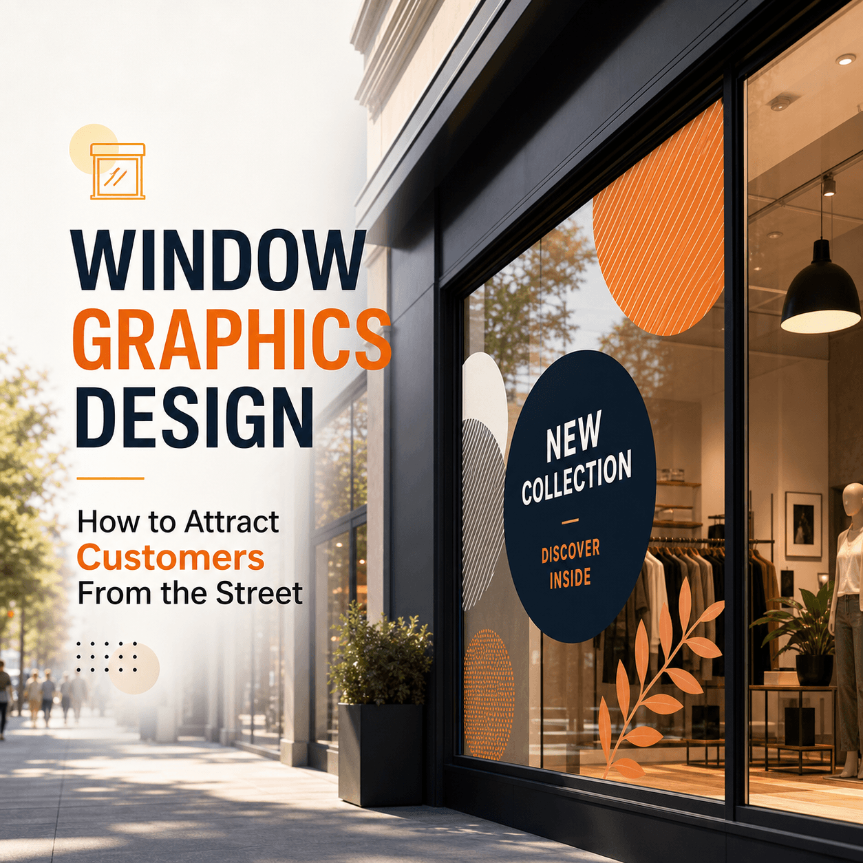
We place the logo into realistic scenarios: website header, business cards, product packaging, signage, social avatars, email signatures, and sometimes even uniforms or vehicles depending on the business. Mockups help you see scale, spacing, and impact quickly.
We also do stress tests:
- We shrink it. We grayscale it. We put it on busy backgrounds. We check it on light and dark. We look at it beside competitors. We make sure it stays recognizable in small spaces and still feels premium in large applications.
If something fails, we go back and refine. This is why professional redesign takes time. The goal is not a cool mark. The goal is a mark that survives reality.
Step 8: Presentation (how we help you choose confidently)
When we present concepts, we don’t just show a row of icons and ask, “Which one do you like?” That approach leads to confusion, committee feedback, and safe choices.
Instead, we present each direction with the reasoning behind it. We explain what it signals, what problems it solves, and how it aligns with the strategy snapshot. We show key variations and core use cases, so you can judge the logo based on performance, not personal preference.
You’ll usually find that the “right” option becomes obvious when it’s framed correctly. It feels like your brand, just clearer and stronger.
Step 9: Revision rounds (where good becomes right)
Revisions are normal. A professional process expects them.
We refine based on structured feedback: what’s unclear, what feels off-tone, what doesn’t scale, what could be simplified, what needs more uniqueness. We avoid endless subjective tweaking by referring back to the original objectives.
Our goal in revisions is to land on a logo that feels confident, not tentative. One that doesn’t need explaining every time someone sees it.
Step 10: Final delivery (files, formats, and brand guidelines)
A redesigned logo is only useful if you can use it everywhere without pain.
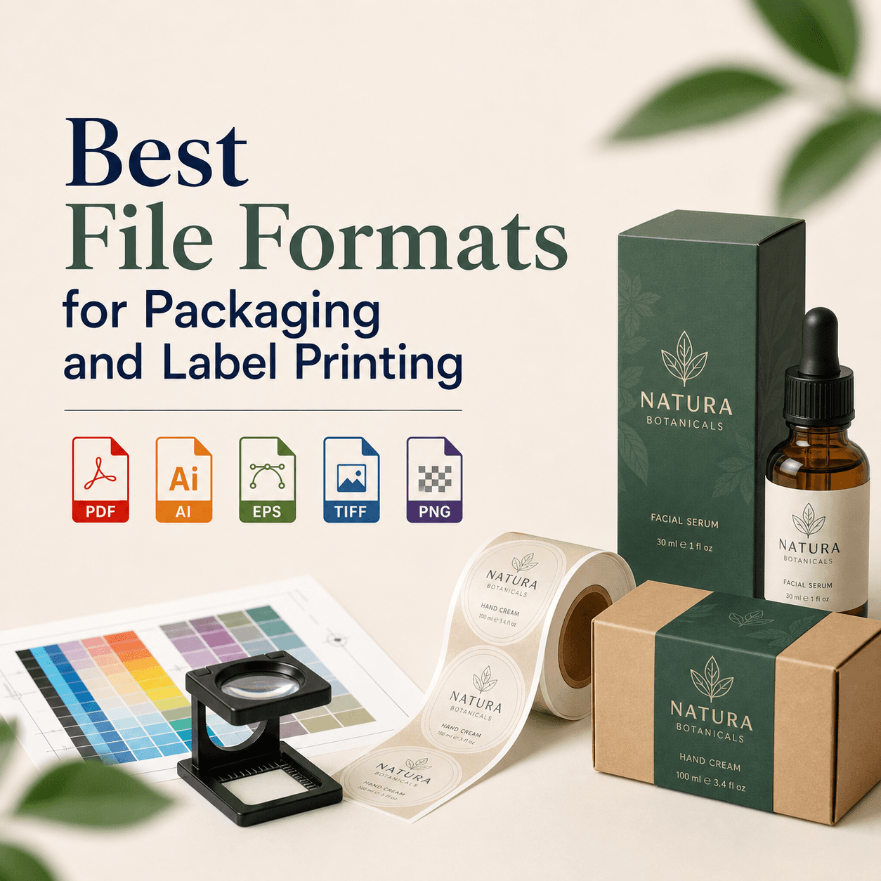
We deliver a complete logo package in professional formats for both print and digital, plus variations that cover the real-world scenarios you’ll face (full logo, icon, stacked version, monochrome, reversed, and so on). We also include basic brand guidelines so your team knows how to use the logo consistently.
This is where a lot of DIY redesigns fail. People get a PNG and call it done. Then they struggle with printing, scaling, embroidery, signage, and anything that requires vector files. We make sure you don’t have that problem.
What makes the Rs Graphic Design approach different
Since 2017, Rs Graphic Design has been built around one core idea: design should deliver results, not just aesthetics. We combine strategic insight with creative execution across branding, print design, packaging, web design, vector illustration, and custom graphic design. That range matters in logo redesign because we don’t design in a vacuum. We design while thinking about where the logo will live, how it will be printed, how it will animate (if needed), and how it will hold up as your brand grows.
We also believe collaboration is part of quality. The best redesigns happen when we can translate what you know about your customers into a visual identity that feels obvious in hindsight.
Common mistakes we prevent during a redesign
A few issues show up again and again when brands attempt redesigns without a clear process. We actively guard against them: redesigning for trends instead of longevity, adding unnecessary complexity, creating a mark that fails at small sizes, losing all brand recognition overnight, and skipping the system that makes the logo usable across every touchpoint.
When you see a redesign that feels “expensive,” it’s usually not because it’s flashy. It’s because it’s controlled.
FAQs
How long does a professional logo redesign usually take?
Most logo redesigns take a few weeks depending on scope, decision speed, and how many applications we’re testing. Strategy, exploration, and revisions matter more than rushing to a quick final file.
Will a redesign hurt our brand recognition?
Not if it’s handled professionally. We evaluate what equity to keep, what to evolve, and what to remove. The goal is to improve clarity and credibility while preserving recognizability where it counts.
What do you need from us to start the redesign process?
We typically need your current logo files, website and social links, any brand notes you already have, and clarity on your goals. Then we guide you through discovery with targeted questions.
How many logo concepts do you present?
We present a curated set of strong directions rather than overwhelming you with dozens. Each concept is shown with reasoning and real-world mockups, so you can choose based on fit and performance.
Do we get all the final logo files we’ll need?
Yes. We deliver professional file formats for print and digital, including vector files and variations (full, icon, monochrome, reversed). We also provide guidance so your team uses everything consistently.
Ready to redesign your logo the right way?
If your logo is holding your brand back, we can help you fix it with a process that’s clear, collaborative, and built for real-world results. At RS Graphic Design, we don’t just “make a new logo.” We uncover what your brand needs to communicate, design it with precision, and deliver a system you can confidently use everywhere. Reach out today, and let’s build a logo that finally matches the quality of what you do.
hello@rsgraphicdesign.com