How to Prepare Files for Professional Printing (Checklist)
Sending a file to a print shop feels simple until you get that email back: “Can you resend this in CMYK with bleed?” If you’ve ever had colors shift, text look fuzzy, or a logo get awkwardly chopped off at the edge, you already know why file prep matters.
The good news is this is not “designer-only” knowledge. With a clear checklist, you can confidently prepare print-ready files that come out sharp, accurate, and exactly how you pictured them.
What “print-ready” actually means (in plain English)
A print-ready file is one that a professional printer can produce without guessing. That means correct size, proper bleed, readable text, high resolution images, fonts handled properly, and colors set up for printing, not screens.
When files are not print-ready, printers either pause to request fixes or they print as-is. And “as-is” is how you end up with pixelation, unexpected borders, missing elements near the trim, and brand colors that look off.
Before you start: confirm these 6 basics with your printer
Printers are not all the same. The safest approach is to confirm specs first, then build your file to match. If you are working with a client, confirm on their behalf so you do not end up redoing layouts later.
Here’s what to ask (or check on the printer’s spec sheet):
- Finished size (the trimmed size, for example 8.5" x 11" or A4)
- Bleed requirement (often 0.125" / 3 mm)
- Color mode (CMYK, or a specific Pantone spot color)
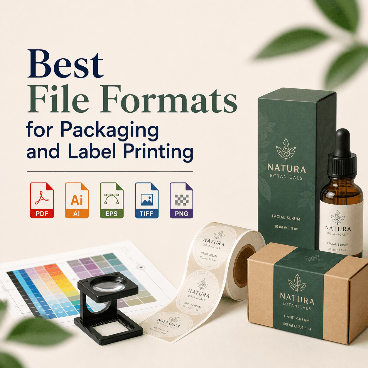
- Preferred file format (usually PDF/X-1a or PDF/X-4)
- Paper stock and finish (matte, gloss, uncoated, etc.)
- Special processes (foil, emboss, spot UV, die-cut, white ink)
Once you have these confirmed with your printer like RS Graphic Design, the rest becomes straightforward.
The professional printing checklist (step-by-step)
1) Set the document size correctly (trim size)
Your artboard or page size must equal the final trimmed piece. If you design a flyer that should be 5" x 7", your document setup should be 5" x 7", not “close enough.”
If you design at the wrong size and scale later, you can accidentally change image resolution, stroke weights, and even text rendering.
2) Add bleed (and extend background to it)
Bleed is the extra area beyond the trim line that gets cut off. It prevents tiny white edges from showing if the cut shifts slightly, which is normal in printing.
A common bleed standard is 0.125" (1/8 inch) or 3 mm on all sides.
What must extend into bleed?
Any element touching the edge: background colors, photos, patterns, and full-bleed shapes. Extend them fully to the bleed line, not just to the trim line.
3) Respect the safe zone (keep important content away from edges)
Just as bleed protects the edge, the safe zone protects your important content.
Keep key text, logos, QR codes, and faces at least 0.125" to 0.25" (3–6 mm) inside the trim. For business cards and small pieces, being conservative here saves headaches.
4) Use CMYK (not RGB) for accurate print color
Screens use light (RGB). Printers use ink (CMYK). If you design in RGB, bright colors can shift when converted, especially greens, blues, and neon tones.
Set your document color mode to CMYK early, and use CMYK swatches as you design. If brand accuracy matters, ask whether the printer recommends Pantone (spot colors) for logos or specific hues.
Quick reality check: even in CMYK, the same file can look slightly different on different paper stocks. Uncoated paper dulls colors; glossy paper makes them pop.
5) Choose the right resolution (avoid pixelation)
For professional printing, aim for:
- 300 DPI for photos and raster images at final size
- 600–1200 DPI for line art (if raster)
- Vector whenever possible for logos, icons, and shapes
A small image pulled from the web is usually 72 DPI and will blur when printed. If you zoom in and it looks soft on screen, it will look worse on paper.
Tip: if you must scale an image up, do it carefully and check effective DPI in InDesign/Illustrator links panel, or image size in Photoshop.
6) Keep logos and type vector when you can
Vector graphics print crisp at any size. Raster logos are one of the most common reasons prints look “cheap,” even if everything else is correct.
If your logo exists as AI, EPS, SVG, or PDF vector, use that. If all you have is PNG or JPEG, consider getting your logo professionally vectorized before printing anything important.
7) Embed or outline fonts (and know which one to choose)
Missing fonts can ruin layouts fast. Printers typically want one of these:
- Embed fonts in the PDF (best when allowed and licensing permits)
- Outline fonts (converts text to shapes, prevents font substitution)
Outlining is safer for print consistency, but it removes editability and can increase file complexity. For long documents or small text, embedded fonts are often preferable when supported.
Also, check your typography basics: avoid super-thin weights on uncoated paper, and be cautious with tiny type. What reads on a backlit screen may fill in slightly on press.
8) Control rich black vs 100K black
Not all black is the same in print.
For small text, barcodes, and fine lines, use 100K (C0 M0 Y0 K100). This prints clean and avoids registration issues.
For large black areas (like a dark background), use rich black (a CMYK mix) so it looks deep rather than washed out. The exact mix depends on the printer, but a common approach is something like C60 M40 Y40 K100. Always confirm your printer’s preferred rich black formula because too much total ink coverage can cause drying and smudging problems.
9) Check total ink coverage (TAC) for your paper
Some printing processes and paper types cannot handle too much combined ink. If total ink coverage is too high, you may see muddy shadows, slow drying, or set-off (ink transferring to other sheets).
A common guideline is 240–300% TAC, but this varies. If you are working on premium packaging or heavy coverage designs, ask your printer what TAC limit to use and export accordingly.
10) Make overprint settings intentional (especially with black)
Overprint can be helpful or disastrous depending on how it’s used. Many workflows set black text to overprint by default, which is often fine. But if a light-colored object is set to overprint accidentally, it may disappear or print unexpectedly.
Always preview overprint in Acrobat or your design app before final export.
11) Use correct PDF export settings (this is where most mistakes happen)
For most professional print jobs, you want a properly exported PDF, not a screenshot, not a Word file, and not a “Print to PDF” quick export.
Commonly accepted standards include:
- PDF/X-1a (flattened, very printer-friendly)
- PDF/X-4 (supports transparency, modern workflows)
If you are unsure which PDF preset to use, refer to the printer’s recommended one. It is the fastest way to avoid back-and-forth.
12) Proof your file like a printer (not like a designer)
Before you send the final file, do a real proofing pass. This is where issues are caught early.
In Acrobat, zoom to 200–400% and check:
Spelling, phone numbers, addresses, and URLs. Those are the classic painful errors. Then confirm alignment, margins, and whether anything important is too close to trim.
If you can, print a quick office proof at 100% size. It won’t match color, but it will catch scale problems, awkward spacing, and readability issues.
As for the PDF export settings mentioned earlier, understanding the differences between PDF/X-1a and PDF/X-4 can significantly impact your printing results.
13) If it’s packaging or labels, request a dieline and follow it exactly
Packaging files often require a dieline for cuts, folds, scores, and glue areas. Do not guess this.
Build your design on separate, clearly labeled layers, and follow the vendor’s dieline rules for:
Cut lines, fold lines, safe areas, barcode placement, and bleed requirements. If white ink or metallic substrates are involved, the file setup usually needs additional spot color layers.
14) Name files clearly and include versions
Printers handle lots of jobs. Help them help you.
Use names like:
Brand_Product_Flyer_A5_PrintReady_v3.pdf
If you are supplying multiple files (front/back, variants, languages), keep them organized and consistent.
Common printing problems (and what usually caused them)
If you want to avoid surprises, it helps to know the “why” behind the most common failures.
Blurry prints usually come from low-resolution images, scaled-up graphics, or raster logos. Unwanted white borders are almost always missing bleed or backgrounds that stop at the trim line. Weird color shifts come from RGB files, uncalibrated expectations, or the wrong profile for the print process. And text reflow or spacing changes usually happen when fonts were not embedded, or the printer’s system substituted a different font.
A quick note about working with a design partner
At Rs Graphic Design, we’ve been doing this since 2017, and file prep is one of those behind-the-scenes details that quietly protects your budget and your brand. Beautiful design is important, but print accuracy is what turns that design into something you are proud to hand out, ship, or put on shelves.
When design, production, and brand consistency work together, you get print pieces that look intentional, polished, and professional every single time.
FAQs
What’s the difference between bleed and margin?
Bleed is extra artwork beyond the trim line to prevent white edges after cutting. Margin (safe zone) keeps important text and logos away from the trim so nothing gets chopped.
Should I send PNG, JPG, or PDF to a printer?
Most professional printers prefer a press-ready PDF because it preserves layout, fonts, and vector quality. PNG and JPG are usually okay only for simple graphics and can lose sharpness.
What is PDF/X and why do printers request it?
PDF/X is a print-focused PDF standard that locks down color handling, fonts, and transparency rules. It reduces errors during production, so printers often request PDF/X-1a or PDF/X-4.
What resolution do I need for printing?
For most print products, 300 DPI at final size is the safe standard for photos. Logos and icons should be vector when possible to stay perfectly sharp at any size.
Why do my printed colors look different than my screen?
Screens display RGB light, while printing uses CMYK ink on paper. Paper type, ink limits, and color profiles also affect appearance, so some shift is normal unless color-managed proofing is used.
Do I need crop marks on my exported PDF?
Not always. Many print shops prefer PDFs with bleed but without crop marks because their workflow adds marks automatically. Only include crop marks if your printer specifically asks.
Should I outline fonts before printing?
Outlining prevents font substitution and keeps typography consistent, but it makes text uneditable and can increase file complexity. If allowed, embedding fonts in a PDF is often a cleaner approach.
What is rich black, and when should I use it?
Rich black is a CMYK mix used for large black areas to look deeper than plain K-only black. Use 100K black for small text and thin lines to avoid registration issues.
Ready to print without the stress? (CTA)
If you want your next print project to come out clean, sharp, and on-brand, we can help. At RS Graphic Design, we don’t just design attractive visuals. We prep production-ready files with the kind of detail that prevents expensive reprints, delays, and “why does this look different?” surprises. Send us your artwork or your idea, and we’ll handle the design, the print setup, and the final polish so you can confidently approve it and move on.
hello@rsgraphicdesign.com