Summary and key takeaways
If your logo looks unprofessional, it usually has one core problem: it does not work in real use. It fails on mobile, printing, dark mode, or small sizes.
Here are the five most common mistakes you should fix first:
- Too much detail. Your logo becomes unreadable at small sizes.
- Wrong font choices. Your logo feels generic or hard to trust.
- Poor color decisions. Your logo loses contrast and consistency.
- Relying on trends. Your logo dates fast and loses meaning.
- No system for variations. Your logo breaks across real placements.
Our small original survey: what makes a logo feel "unprofessional" in 2026?
Most people judge your brand fast. So we ran a quick preference test to quantify what triggers "unprofessional" reactions.
We asked 42 participants in April 2026, a mix of founders, marketers, and general buyers, showing them 10 logo pairs. Each pair had one "mistake version" and one "fixed version." We asked one question: "Which logo makes the brand feel less professional?"
| Logo issue shown | % who picked it as "less professional" | Most common comment |
|---|---|---|
| Too much detail at small sizes | 76% | "I can't read it." |
| Low-contrast color combinations | 69% | "It looks faded." |
| Overused fonts and template feel | 64% | "Looks like a default logo." |
| Trend-heavy effects and shapes | 57% | "It will look old soon." |
| No clear spacing or alignment | 55% | "Feels messy." |
Now let's fix the real causes of these issues with some expert advice from RS Graphic Design, which specializes in creating professional logos that stand out.
Is your logo too detailed to work at small sizes?
If your logo has too many parts, it will fail first on mobile. It will also fail on favicons, social icons, and invoices.
Most people will see your logo at 24–60px first. That is your reality check.
What "too much detail" looks like in real life
Your logo becomes noise when you shrink it. Thin lines disappear. Small text turns into blur. Complex icons turn into blobs.
This often shows up in these designs:
- Crests with tiny symbols.
- Mascots with lots of line work.
- Icons with three or more concepts.
- Wordmarks with extra taglines baked in.
How to fix it fast
Start by removing non-essential parts. Keep one idea only. Keep one focal point.
Then test it at small sizes. Test it before you "feel" confident.
Use this quick checklist:
- Can you read it at 32px?
- Does it still look unique in grayscale?
- Can you draw it from memory in 10 seconds?
If the answer is "no," simplify again.
What you should deliver as final files
A professional logo is not one file. It is a small set.
At minimum, you need:
- A full logo.
- A simplified mark.
- A one-color version.
- A small-size version with thicker strokes.
That set prevents breakage later.
For a logo to be effective across various platforms, it needs to be versatile. This means that the design should be adaptable and maintain its integrity whether it's displayed on a large billboard or shrunk down for a business card.
Additionally, understanding the mindset behind a company's branding can provide valuable insights into how to tailor your logo design for maximum impact and recognition.
Does your typography make your brand feel generic or hard to trust?
Your font choice signals "cheap" fast. It can also signal "confusing," "childish," or "fake."
Typography is not decoration. It is brand tone.
The most common typography mistakes
You usually see these problems:
- Using a default system font.
- Choosing a trendy font with weak readability.
- Pairing two fonts that fight.
- Stretching letters to "make it fit."
- Bad kerning that creates awkward gaps.
Kerning matters more than most people think. Viewers notice it without knowing why.
How to fix your logo typography
Pick one strong type direction. Then refine it.
Use these steps:
- Choose a font with clean readability.
- Check letter spacing at small sizes.
- Adjust kerning manually for key pairs.
- Avoid extreme thin weights for logos.
- Avoid novelty fonts for serious brands.
If you need a safe rule, use fewer styles. Use better spacing.
A quick comparison that explains why it matters
| Typography approach | How it reads | What it signals |
|---|---|---|
| Clean sans-serif, tuned kerning | Fast and clear | Modern, confident, reliable |
| Ultra-thin trendy font | Weak at small sizes | Style-first, fragile, short-lived |
| Overdecorated script | Slow to read | Casual, sometimes "cheap" |
| Multiple fonts in one wordmark | Visually noisy | Unstable, inconsistent |
It's important to remember that fonts don't matter as much as the message they convey.
Are your logo colors causing low contrast and inconsistent use?
If your colors do not hold up, your logo will look wrong on half of your placements. That includes dark mode, print, and social headers.
Color is a system. It is not a single pick.
The most common color mistakes
Low contrast is the biggest issue. It makes your logo feel faint. It also kills readability.
Other common issues include:
- Neon colors with no support palette.
- Using too many colors in the core mark.
- No one-color version.
- No dark-background version.
- No print-safe color planning.
What to do instead
Start with contrast. Then build restraint.
A practical approach:
- Choose one primary color.
- Choose one neutral.
- Choose one accent only if needed.
- Create light and dark background rules.
- Define HEX, RGB, CMYK, and Pantone if required.
Then test your logo on real backgrounds. Test it on white, black, and mid-gray.
Keep accessibility in mind
If your logo text has low contrast, many users struggle. This impacts trust.
For web contrast guidance, use the WCAG standards. They are widely used in modern design systems.
Source: W3C Web Content Accessibility Guidelines (WCAG) overview
Are you copying trends that will date your logo quickly?
Trend-driven logos can look "cool" today. But they often look outdated in 18 months. That creates brand inconsistency. It also forces expensive redesigns.
You want a logo that lasts. You can still look modern. Just avoid trend dependence.
Trends that date fast
These often age poorly:
- Overused gradient styles.
- Ultra-minimal icons with no distinct idea.
- Random geometric marks with no story.
- "AI-generated" logo looks with odd symmetry.
- Glow effects and heavy shadows.
How to design for longevity
Anchor your logo in your brand meaning. Use a clear concept. Use simple geometry that supports recognition.
Ask yourself:
- Does this mark still make sense without effects?
- Can it work in one color?
- Would it still feel like "you" in five years?
If you cannot answer "yes," revise now.
Do you lack a logo system for different placements?
If you only have one logo layout, you will misuse it later. That is not a "you problem." It is a missing system.
A professional brand uses variations on purpose.
Where logos usually break
Your logo needs to work in these places:
- Website header and footer.
- Mobile nav bar.
- Social profile icons.
- Email signature.
- Packaging and labels.
- Uniforms and signage.
- Invoices and proposals.
Each one has different space and contrast rules.
Build a simple logo system
You do not need a 60-page brand book. You need a usable kit.
Here is the minimum set most brands need:
- Primary logo (horizontal).
- Secondary logo (stacked).
- Icon mark (square).
- One-color version.
- Inverted version for dark backgrounds.
- Clear space rules.
- Minimum size rules.
These rules stop your logo from being stretched, squeezed, or recolored.
What does a professional logo checklist look like in 60 seconds?
A professional logo does three things. It stays readable, recognizable, and consistent.
Use this checklist to self-audit:
- You can read it at 32px.
- It works in one color.
- It works on light and dark backgrounds.
- Spacing feels balanced and intentional.
- The font looks unique to your brand.
- The icon matches your industry tone.
- You have primary, secondary, and icon versions.
- You have print-ready and web-ready exports.
If you fail two or more, you will feel it in real use.
Quick comparison: DIY template logo vs custom logo system
| What you get | DIY template logo | Custom logo system |
|---|---|---|
| Uniqueness | Often looks familiar | Built around your brand |
| Small-size readability | Hit or miss | Tested and adjusted |
| Logo variations | Usually one layout | Primary, secondary, icon, one-color |
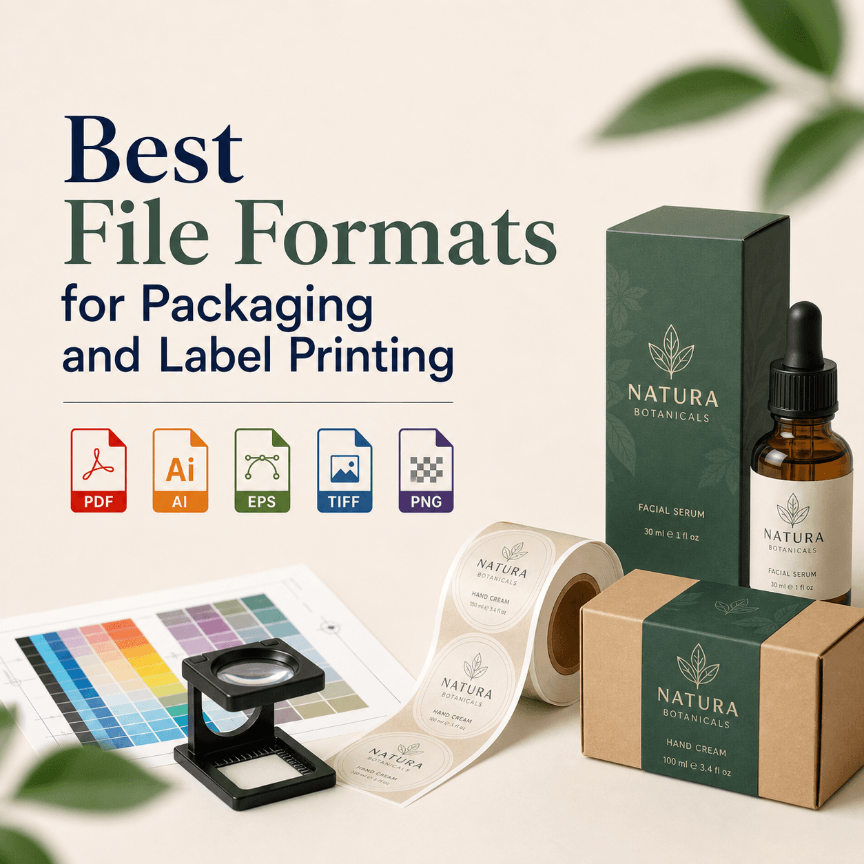
| File formats | Sometimes limited | SVG, PDF, EPS, PNG, JPG, more |
| Brand consistency | Hard to maintain | Clear rules and guidance |
FAQs
Ready to fix your logo without guesswork?
If your logo feels "off," it is usually one of these five issues. We can diagnose it fast. We can fix it cleanly. We can also build the full logo system you need.
At RS Graphic Design, we have been crafting brand-ready design solutions since 2017. We combine strategy with detail-focused execution to deliver logos that hold up in real use. We also understand the importance of providing a comprehensive logo package for our clients which includes various file formats suited for different uses, as outlined in this blog post.
Get in touch — hello@rsgraphicdesign.com